Applying the band-aid, missing the wound
Common mistakes in stacked column charts
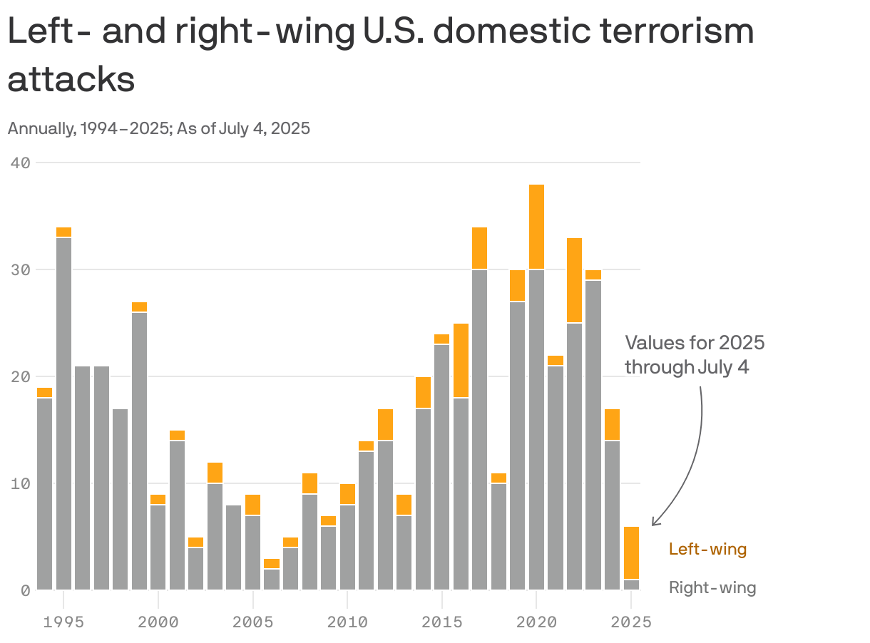
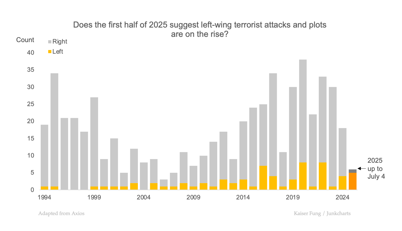
Long-time reader Chris P. sent me the featured column chart, through a tweet. The original was published in an Axios article (link).
The Axios author sourced the data to an CSIS report (link), which means the original original is this column chart:
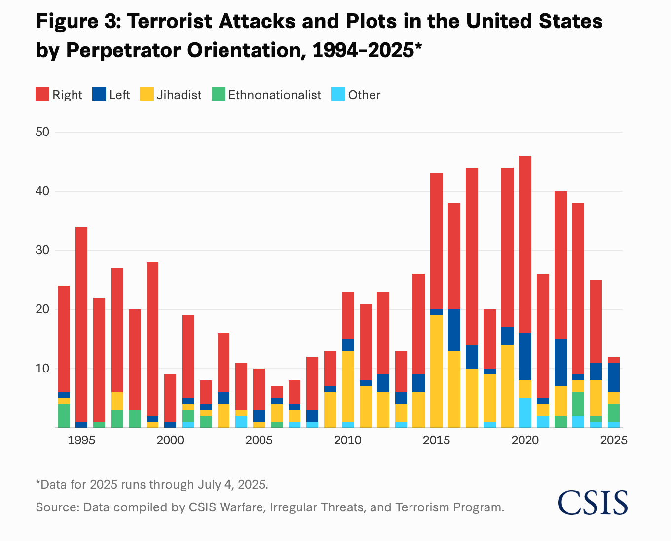
The Axios chart is a subset of this CSIS chart, after dropping the last three categories of Jihadist, Ethnonationalist, and Other. This is an unorthodox distillation of a chart; typically, one would combine those three categories into "Others" and keep it on the plot. By removing them completely, the reader may mistakenly assume that the column heights represent the total count of "terrorist attacks and plots."
Amusingly, the CSIS report is headlined "Left-wing terrorism...." – the story being pushed is that if one looks at 20 years worth of history, and predicts what might happen in the next few years, one should ignore all the data except the last 6 months.
On a report centering left-wing terrorism, the data in the stacked column chart are ordered in such a way that the left-wing components (dark blue) sit in the middle of the stack. This means that every such block starts at a different base level, making it difficult to compare heights.
The designer recognizes this difficulty, and uses an interactive element to overcome it. Clicking on one of the blocks pushes all the other blocks to the background:
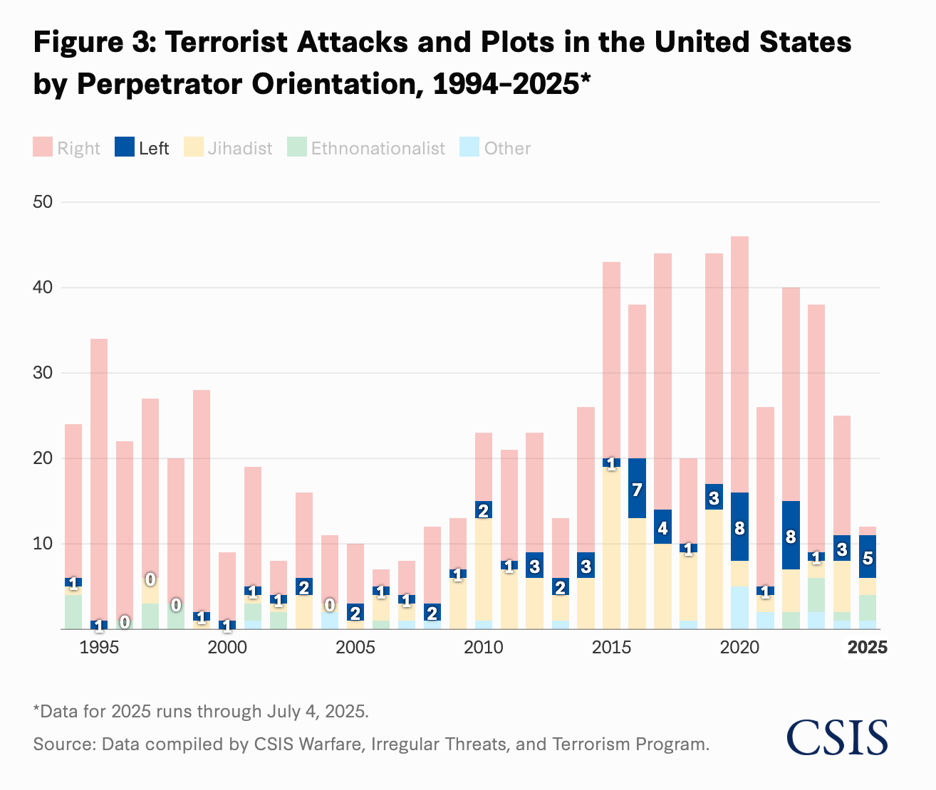
I'd call this a "band-aid." It doesn't cure the malady but it is an improvement.
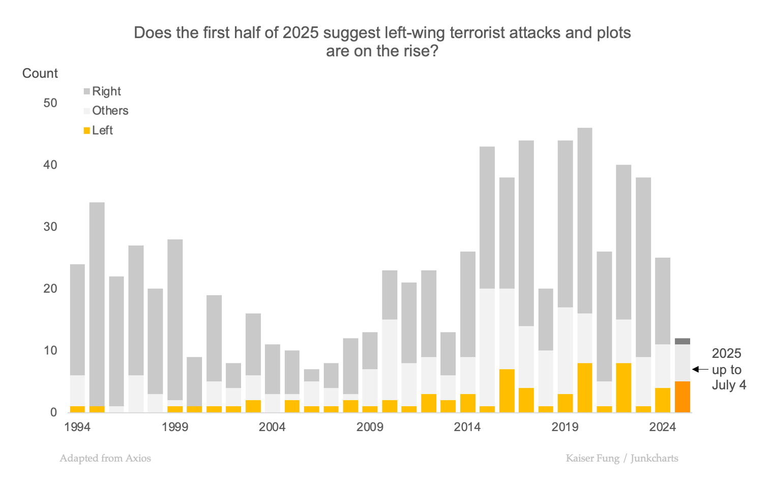
The Axios designer applies a different solution – reducing the number of categories plotted to two. With two categories, the subject of order becomes even more prominent: the category shown at the bottom has blocks that start on the horizontal axis while the category shown above is given floating blocks that start at different levels.
Amusingly, Axios then places the left-wing data in the floating blocks, which means it applied the band-aid but missed the wound!
This is what the same chart looks like when the order of the categories are reversed:
The trend in left-wing attacks and plots (orange) is much clearer.
Here, I combined the three omitted categories into "Others":