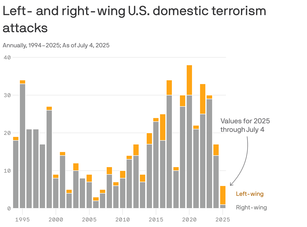
Can measure vs should measure
Sources of inaccuracy in data
Enrico Bertini has been putting out a lot of good content lately. In this post (link), he advises that "no amount of design or data processing skills can overcome problems inherent in the data due to the way it was generated and collected."
Readers here will be familiar with this sentiment. This is one of the reasons why I created the Junk Charts Trifecta Checkup. Under this framework, the problem raised by Enrico is identified as a "Type D" chart, defined as a chart that deploys a good visual design to answer a well-posed problem but as data visualization, because it fails to convey the meaning of the underlying data.
Enrico goes on to delineate the modes of failure:
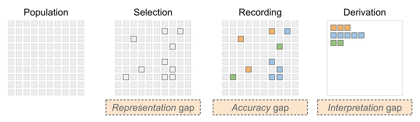
Let's walk through these concepts, while mapping his terminology to other similar concepts you may have heard of. For simplicity, I'm going to imagine below a dataset that measures consumer behavior, so the unit of measurement is a person.
Representation gap – this happens when the observed sample of people does not fully represent the "population" of people that the analyst intends to describe. This is otherwise known as sampling bias but I do like Enrico's alternative phrasing. Depending on your discipline, you may also call it selection or filtering effect.
Accuracy gap – this is familiar to statisticians as measurement error, defined as the gap between the (unobservable) true values and the observed values. If we are measuring someone's weight, it may be the case that the scale does not give accurate measurements - the inaccuracy can be a systematic bias (e.g. it starts not from zero) or the scale can suffer from a high margin of error, or both at the same time.
Interpretation gap – this issue is sometimes called low construct validity. The problem is what is measured isn't quite what one wants to measure. This happens in real life because we measure what we can measure, which is not necessarily the same as what one ought to measure. Note that this issue exists even where there is no measurement error (or accuracy gap). The act of using a "proxy" measure creates this interpretation gap.
Consistency gap – I see this is a component of the measurement error mentioned above. This has to do with variability across multiple measurement devices, for example, different interviewers when conducting surveys. In addition to variability within each instrument, there may be differences between instruments.
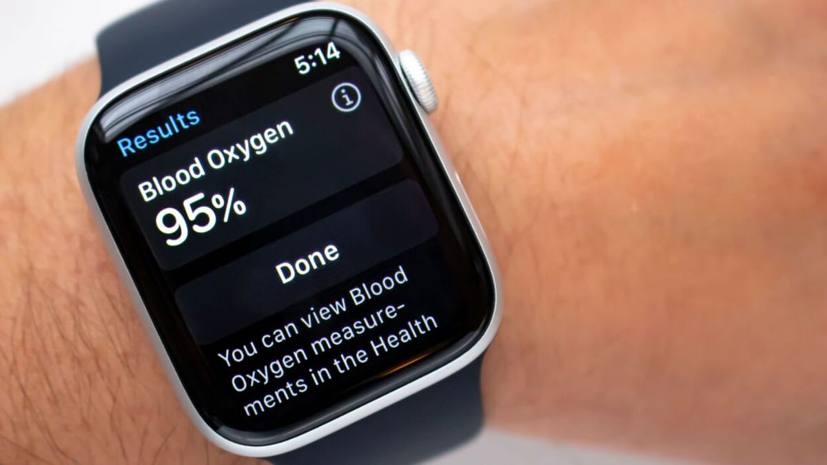
I have always been fascinated by how a device like the Apple Watch measures a user's blood oxygen level. Below is an excerpt of what AI tells me how Apple's technology works:
**Infrared Light and Red Light**: The watch features a specific set of sensors that emit both infrared and red light. These lights penetrate the skin and are absorbed differently by oxygen-rich (arterial) and oxygen-poor (venous) blood.
**Photodiodes**: These sensors then measure the amount of light that is reflected back to the watch. By analyzing the reflected light, the device can calculate the proportion of oxygenated versus deoxygenated blood.
This answer is actually incomplete because what shows up on the Apple Watch is a single percentage that presumably ranges from 0 to 100%. It is not a proportion.

So, I asked a follow-up question:
Explain this more. "By analyzing the reflected light, the device can calculate the proportion of oxygenated versus deoxygenated blood."
The key bit is this:
**Ratio Analysis**: The device analyzes the ratio of red light to infrared light that has been reflected back.
- High levels of infrared light indicate a higher concentration of deoxygenated blood, while high levels of red light indicate oxygenated blood.
**Algorithm Implementation**: Using complex algorithms, the watch converts these measurements into a percentage of blood oxygen saturation, usually expressed as SpO2.
- Normal SpO2 levels typically range from **95% to 100%**; levels below this may indicate potential health issues.
Note where it mentions "complex algorithms". So, what the watch actually measures are the levels of red and infrared light reflected back. What the user expects to be measured is the blood oxygen saturation percentage. There is an "interpretation gap" because the algorithms take what is measured, and transforms them to what we ought to measure; the value shown on the watch is an indirect, proxy measurement that inherently involves construct validity.
Further, any device has measurement error. Some of this is caused by the user, e.g. is the watch tightly fitted on the wrist. Even if we accept the proxy measure as sufficient, the observed values may still deviate from the truth. Add to this the inconsistency from one Apple Watch to the next.
I further asked AI what methods of measurement are used in a clinic.
The answer describes two options: a non-invasive method that uses fingertip sensors and relies on "complex algorithms" similar to the Apple Watch; and an invasive procedure (arterial blood gas analysis) that draws blood out, and more directly measures the blood oxygen level (along with other tests).
In this case, what ought to be measured can be measured more directly. The trade-off is a less accurate but more available method.