Peak social media? Depends on how you measure it
Separating individual and group effects over time
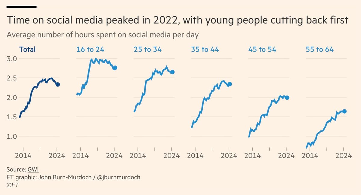
John at the Financial Times produced the above graph, with the headline "Time on social media peaked in 2022, with young people cutting back first" (link).
What does he really mean?
The first part probably refers to the first chart on the left, showing the aggregate population in the study. The study measures the "average number of hour spent on social media per day." It's a double average: average per day, and average per person. He's describing the peak in the curve observed in 2022, followed by a downtrend in the last two years.
The second part probably refers to the set of line charts starting from the second-left chart. Here, he disaggregated the dataset by age group. Each line represents social-media usage of people in the labeled age group. The first three lines exhibit dips at the end, similar to the aggregate while the last two age groups do not show a downward slope. This is summarized as "young people cutting back first".
There is more we can see from these very nicely drawn charts. For example:
- The older someone is, the less time they tend to spend on social media (the entire lines shift lower as we move left to right)
- From 2014 to 2020 (roughly speaking), the average person increased their social-media usage, so did the average person representing each of these age groups (every line rose steeply during that period)
"Young people are cutting back first." This statement is quite ambiguous. An unspoken corollary is that older people are not yet cutting back. The statement also implies that young people are reducing usage as they become older, as there can be no other way.
So, there are two distinct issues to consider:
- young people reduce social-media usage as they age (e.g. have family commitment, less free time)
- young people of today use less social media than young people of the past (e.g. no longer "cool", has other pastimes)
The first point concerns the aging process of individuals while the second point suggests a cultural or generational factor. These are different things.
The FT charts address the second point only. The reduction in social-media usage is observed between one "generation" and the previous.
In order to study the first point, one needs a "cohort analysis" in which the cohort is defined by birth year. Think about tracking individuals as they age.
In the FT analysis, the building block is the single-age subgroup, e.g. 18 years old. Between 2014 and 2024, anyone who's 18 years old belongs to the 18 group; these people have birth years from 1996 to 2006.
A lot changed between 2014 and 2024. In 2014, Instagram had 200 million active users and was a photo app; by 2024, it claimed over 2 billion users, and has pivoted to videos. In 2014, Snapchat and Whatsapp were just gaining traction; Tiktok hasn't even launched; the concept of an influencer was novel. Being 18 in 2024 is very different from being 18 in 2014!
When analysts from a subgroup, we are claiming that people in the subgroup can be treated as "alike." Sometimes, this isn't the case. The FT analysis further combines several single-age subgroups into larger age groups. For example, the 16-24-year-old age group contains nine single-year subgroups, and together, the people in this age group has birth years spanning 1990 and 2008.
Alternatively, we can build birth year cohorts. The most recent cohort that contributes data to John's dataset consists of those born in 2008. These youngsters reached 16 years old in 2024, the last year of data collection. This group is not very informative as we only have one year of observations. One year does not make a trend. We don't yet know how much social media they will consume when they reach 30.
A more interesting cohort are those born in 1998. In 2014, they were 16 years old and thus, became part of this study. By 2024, they were 26 years old. The study followed them for 10 years. They contribute to our understanding of social-media usage of people between 16 and 26 years old.
Birth-year cohort is a direct analysis of the effect of aging. Generational change can be captured by modeling level shifts between different birth-year cohorts. For example, the curve for those born in 2000 should probably start at a higher level of usage and possibly remain at a higher level than the curve for those born in 1970.
In this last section, I attempt to illustrate the ties between the age cohorts and the birth-year cohorts, using FT's charts. I can only tell part of the story because the aggregation has wiped out some of the necessary data.
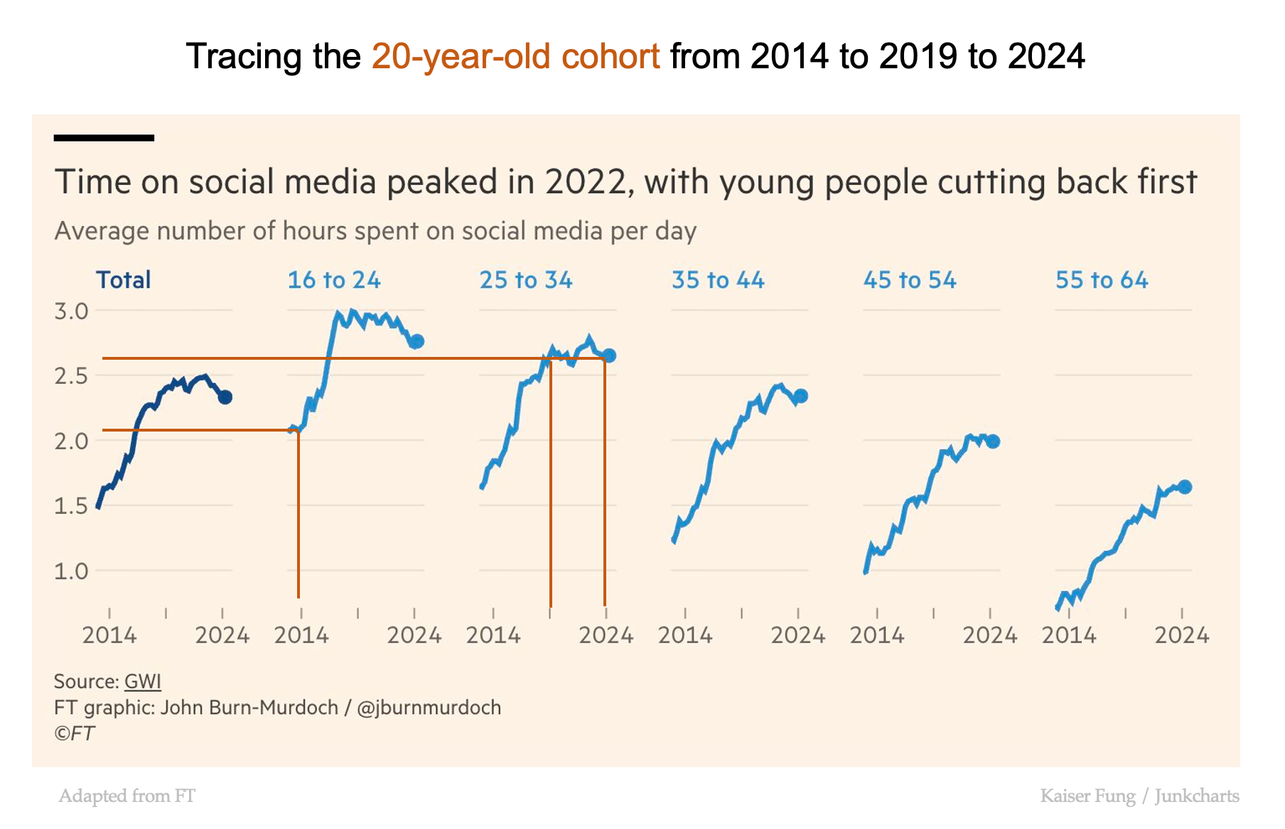
Let's consider a 20-year-old in 2014. This person sits in the middle of the 16-to-24 age group. According to the chart, the average such person consumed about 2.1 hours per day of social media in 2014.
Five years later (2019), this person was 25 years old, and therefore, his/her data fell into the 25-34 age group. In 2019, that age group on average used 2.6 hours per day of social media. Another five years later (2024), the person is 30 years old. Still part of the 25-34 age group, s/he is still associated with 2.6 hours per day (we can't say anything more unless we have single-age cohorts.)
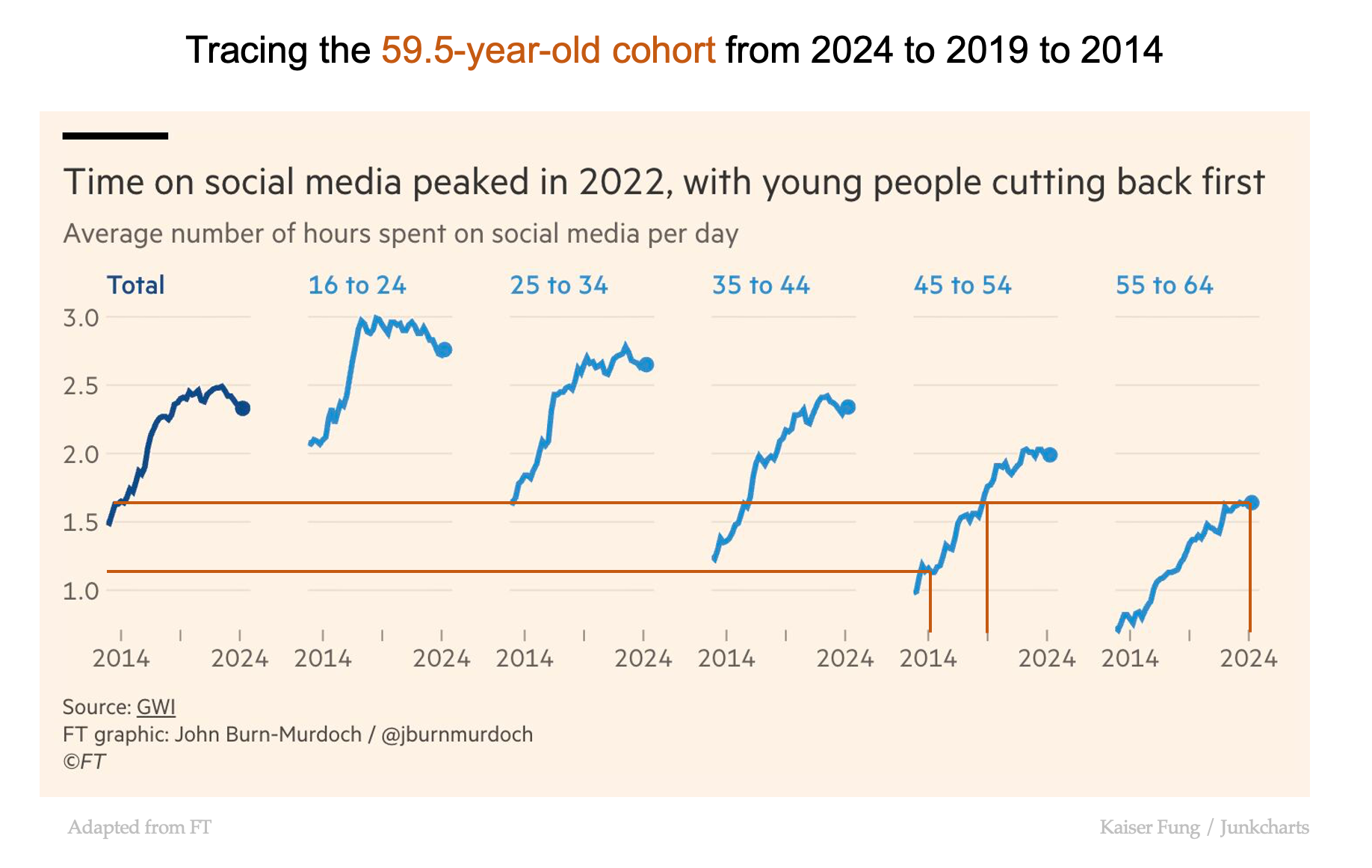
Let's take another group (55-to-64), for which the middle age is 59.5. In 2024, the average usage was around 1.6 hours per day. Five years earlier, in 2019, the 59.5-year-old was 54.5 years old, which means the data fell into the 45-to-54 age group. The average for that age group in 2019 was also 1.6 hours per day. Another five years earlier, in 2014, the 59.5-year-old was 49.5. The age group remains the same; the usage level in 2014 though was much lower, at 1.1 hours per day. (Once, again, we need single-age cohort data to know if this aggregate number is representative or not.)