A budding field

Avinash has an interesting piece about some examples of visualization of Web data. That's a very rich area since there is so much data. I agree with his observation that there are precious few truly great charts that have thus far appeared. (Note, though, that typically the more data, the more noise. See this post.)
He discussed a tag cloud display of the top cities from which website visitors hail. We like tag clouds too. See here, here and here.
He praised a particular pie chart because "the pie ... is just a stage prop". It worked because all the data was printed on the chart itself. This violates our self-sufficiency principle: if all the data is printed on the chart, and the only way to read it is to look at the data, then the chart serves no purpose. More here.
He liked the Amazon's feature of customer ratings distributions. Me too. A powerful example of small graphics that make a huge impact. Here is the typical Web rating display:

Almost everyone uses the statistical average. This hides information about how dispersed (or not) customer's reactions were. The current Amazon display gives us this information:

Notice that 108 customers actually gave this book the lowest rating even though the average was four stars.
The most intriguing example was Google's comparison of keyword performance to the site average. It's a good idea but the execution is wanting.
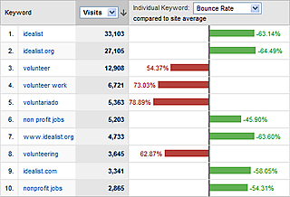
Firstly, I believe the percentages are much better presented as index values, with 100 being the site average. Secondly, it is unnerving to have red associated with positive values, green with negative values, or to have negative values on the right of positive values. I think they realize green and to the right should represent "good" (bounce rate of visitors lower than average) but this just doesn't work. Thirdly, are the data labels really necessary? they impede our sight lines when comparing bars. And do we need to know to two decimal places?
PS. Apologies for the inconsistent font. Typepad continues its mischief: I couldn't change the font size after adding a hyperlink. Apparently I have to fix the font size before adding a link. You also might notice the changing font size as I write this paragraph. Don't know why there was a switch; I didn't ask for it.
