A graphical playground
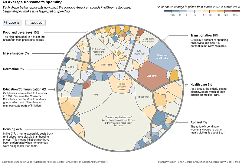
RichmondTom pointed us to this New York Times article, which made what I consider a sloppy argument for the inflation rate being over-stated rather than understated. This article was accompanied by a colorful and playful chart to describe which components make up the index, and which price changes were most drastic.

Like most "infographics", this chart has an interactive feature which you need to click here to sample: mousing over the strangely-shaped areas leads to annotations describing the weight of the relevant component, and the change experienced in that component during the past year. Like Sherlock Holmes holding a magnifying glass, the reader can use the Zoom In, Zoom Out buttons to drill down.
Here is an expanded view on the color scale, with my comments.
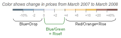
We have no issues with the blue or the red & orange regions but what with using light blue and light green for increases between 0 and 4 percent (when all other increases use red)? Readers not looking at the color palette will be caught off guard, misinterpreting the data. This is a big problem since those two appear to be the most frequently occurring colors on the chart.
The designer of this chart surely is aiming for entertainment, creating a playground for the data sleuth. It succeeds if readers take up the invitation to explore the data. Unfortunately, it is not the most accessible for more sophisticated numerates interested in understanding the data.
It is impossible to ascertain the relative size of pieces that are close in size but often in arbitrary shapes. We can roughly read out which components are most important to the index: turns out to be "owner's equivalent rent" by a mile. Owner's equivalent rent, as discussed by Leonhardt, is the most problematic and inaccurate component, and also, I might add, most susceptible to manipulation since it is an estimate, not a measure. The next biggest pieces -- food and gasoline (excepting rent) -- are taken out because of "volatility".
The most interesting information in this data set is missing: how much does each component contribute to the overall inflation rate? This requires multiplying the weight of each component with the change of each component.
It would also be helpful to label which components are taken out of the Bernanke calculation that claims only a 4% inflation when my cable company seems to have raised prices every six months, and groceries and meals and so on are rising at 10-20%. (Of course, Leonhardt thinks this is all loss aversion.)
Reference: "Seeing Inflation Only in the Prices That Go Up", New York Times, May 7 2008.


