A second look at that axis
Why are there gaps in the labels?
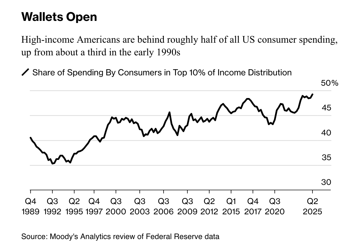
In the book blog (link), I wrote about this Bloomberg chart. Found here.
At the end of that post, I noted the unusual labeling in the time axis. I had to take a second look.
What first unsettled me was the sudden gap in labels at the right side between Q3 2020 and Q2 2025. Then, I looked back on the rest of the labels, and on first glance, it didn't seem like those time intervals were even.
Now, I have pulled out my ruler, and measured everything - and phew, they spaced the tick marks appropriately. Not too surprising, given it's a Bloomberg graphics piece.
The graph has 13 ticks and 12 intervals between ticks. Half (6) of those intervals span 11 quarters, three of them 12, and one of them 10. That leaves the last and widest interval which accounts for 19 quarters.
I can't figure out why they wouldn't use evenly spaced labels. The wiggles in the line suggest that they have the data for every quarter.
I'm also mystified by the decision to omit labels between 2000 and now.
Maybe it's because there isn't enough space because 19 = 11 + 8. Why not extend the axis line a little so there is a little additional whitespace but then the omitted label will fit?
I like this theory - now I think the reason why some intervals are 11 quarters and some are 12 quarters is that tick placement is dictated by getting the labels to fit.
Do you have a better theory?