A world full of bubbles
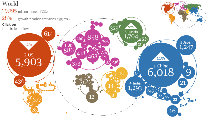
As promised, we stick to bubbles. Like the street artist blowing soap bubbles at passers-by, this map -- published in the Guardian (UK) -- is a gift of bubbles.
And our reader Frederic M. is not amused. "A tremendous failure", he said.
In terms of conveying the data, a simple bar chart would do a better job in exposing the biggest polluters, as well as the relative magnitude between the biggies and the small fish.
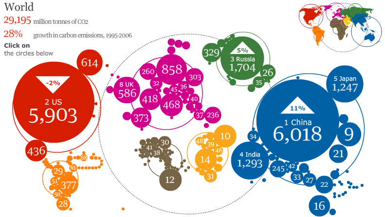
The chart reveals more problems if one clicks on, say, Europe, and sees the following:
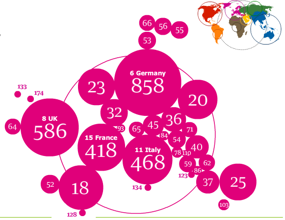
For starters, compare the bubbles labeled 858, 468, 586, 418 with those labeled 23, 20, 18. And look at the little ones in the periphery labeled 133, 174, 128. Baffling, isn't it?
What they did was to print the ranks for every country, except the top four in Europe for which the ranks are placed next to the country name (in small font), and the actual amounts are placed in the middle of the bubbles. The ranks, of course, are pretty useless, and they obliterate the scale of the differences between countries.
Besides, the bigger the polluter, the smaller the rank but the larger the bubble. This built-in disconnect can also be disorienting.
Every bubble chart typically contains lots of data labels, and the reason is that the bubble form lacks self-sufficiency. Without the data labels, the reader has trouble comparing the areas.
Reference: "The Carbon Atlas", Guardian, Dec 9 2008.


