Alternatives to radar chart 1
Sometimes, a table is all you need

The radar chart is frequently used in the following setting: you are comparing some objects across K dimensions. Embedded in this data are K+1 rankings, which include K rankings, one for each dimension, plus an aggregate ranking.
My last post explains why I don't like the radar chart. In this post, I'll explain why the radar chart conveys the information worse than even a data table.
Here is a very simple dataset I'll be using:
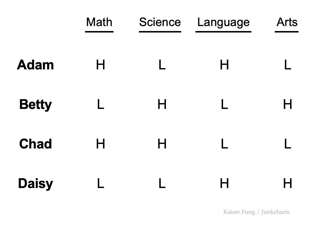
Four students are rated on four subjects. Each rating is either High or Low. Each student earns two Highs and two Lows. Chad and Daisy (last two rows) are strong in Math/Science and Language/Arts respectively. One is the mirror image of the other. Adam and Betty are also mirror images of one another.
On an unadorned data table, the reader can already find various insights. Who's the best at Math? Adam and Chad. Who's good at Math & Science? Chad. What subjects are Betty performing well at? Science and Arts. What subjects do Daisy need help with? Math and Science. Is Betty or Daisy better at Arts? Daisy.
Now, try finding answers to those types of questions from this radar chart?
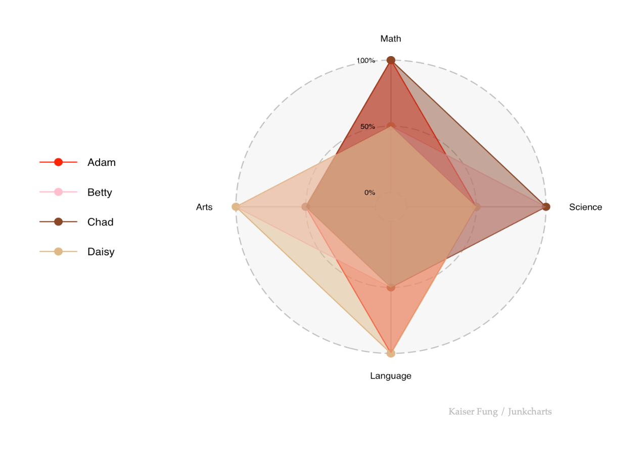
OK, the overlapping areas are distracting and annoying. Try this line version:
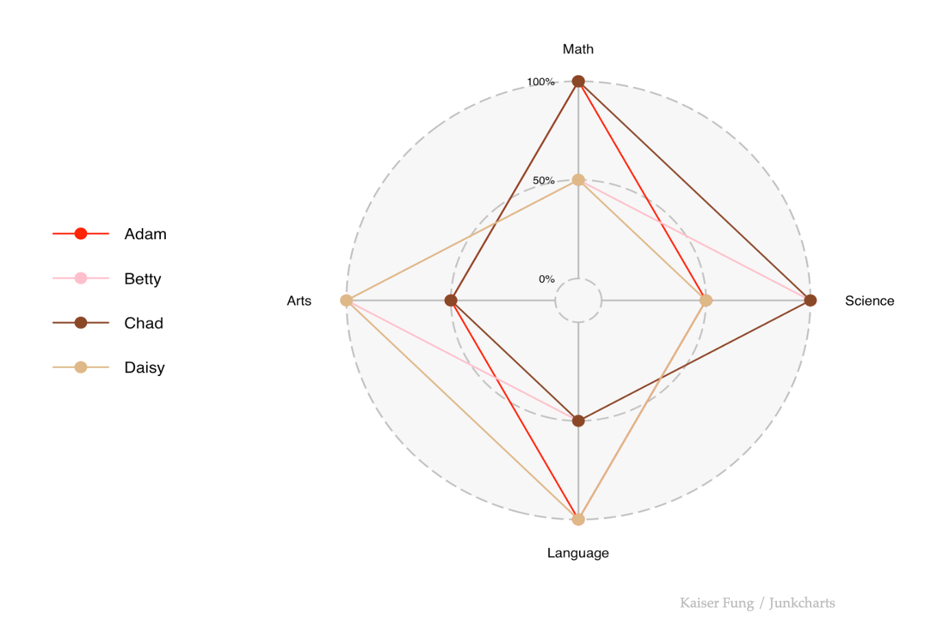
Not much better. In fact, this quick exploration reveals yet another reason to unplug the radar. It doesn't like categorical data, or any data with a good number of equal values. Equal data values cause lines (or perimeters of areas) to over-print.
But it also doesn't handle continuous data. Imagine we add jitter to the equal values so they are minutely separated. This turn the overlapping lines into separate lines with different angles, producing even more criss-crossing!
Instead, let's do a small-multiples arrangement:
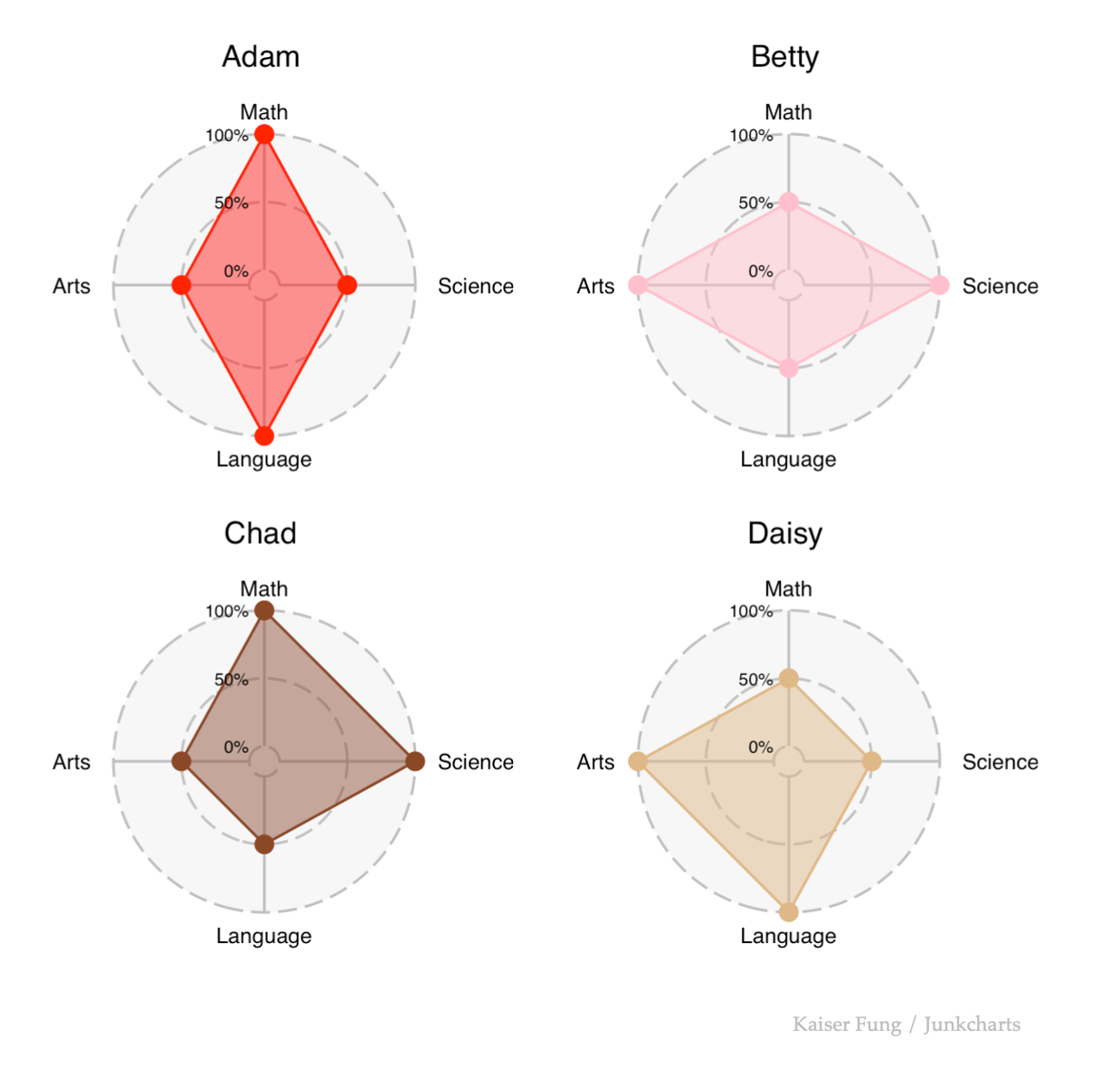
At least the data become visible. However, this arrangement makes it harder to answer many of the questions we care about. Who's the best at Math? We have to look at all four charts. Is Betty or Daisy better at Arts? We have to compare two charts. What help does Daisy need? This one can be read from a single chart but it's still not as easy as the data table.
The data table can be "enhanced" by adding color, styling, and symbols.
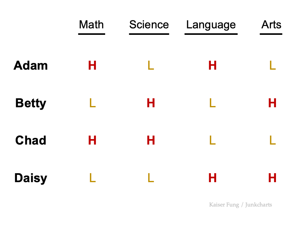
Our eyes are really great at sorting out two categories. Just a little color and bolding is sufficient.
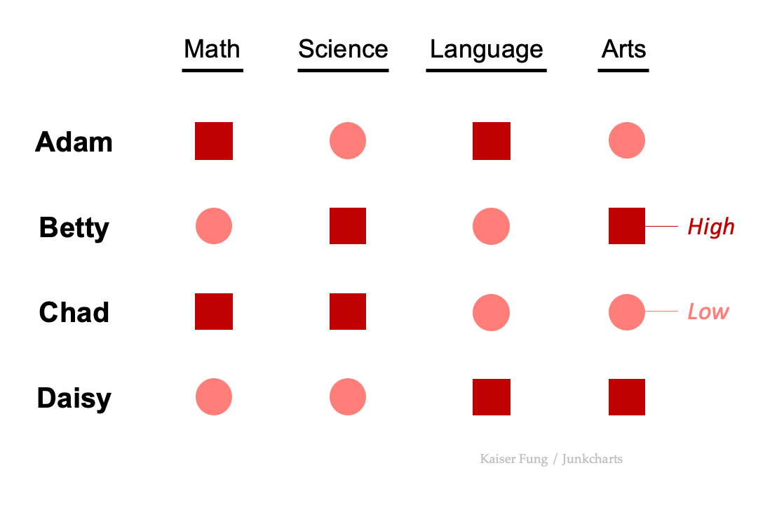
Symbols are also useful:
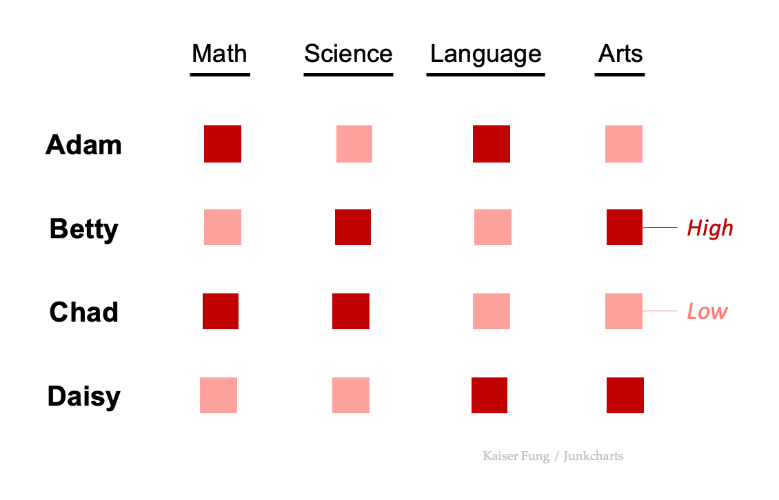
With symbols, I better add a legend.
Even better is if I vary both symbols and colors:
In future posts, I'll explore other options.