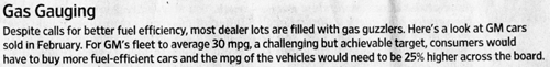
An achievable target. And how?
The Wall Street Journal tells us that GM car buyers may react to the "volatility" of gas prices by demanding higher miles-per-gallon from their vehicles. They commissioned an analysis which finds that new GM cars sold today on average have an MPG of only about 21, and suggested that 30 would be a "challenging but achievable target". (Article here).
There are many problems with the analysis, such as no specification of when such a target should be met, and whose target this is, nor any comment on the potential impact on car sales (since higher-priced vehicles tend to have lower MPG) or the existence of government subsidies for larger (lower-MPG) vehicles. Complete silence too on reducing pollution or lowering our dependence on gasoline.
In any case, let's focus on the chart that comes with the article. First, take a look at the caption:

Then, the chart itself:

***
Readers is presented with this puzzle: how could a minor shuffling in the mix of cars lower the average MPG to 30 when today, the least gas-guzzling vehicle class (subcompact) only averages 30.6 MPG, barely above the target?
Oops, the chart portrays (less than) half of the solution. Tucked into the caption, the analyst tells us that she has assumed an across-the-board increase of 25% in MPG for every class of vehicle. Think this information is important? Perhaps so. A 25% improvement is about 5 MPG, bringing the average MPG (at the current mix of sales) to 26.5, so the shift in mix of vehicles accounts for about 3.5 MPG of the targeted improvement.
While the chart designer very sensibly ordered the vehicle classes from highest to lowest MPG, it is baffling why the row of MPG data is not labelled directly but given a dark background so as to justify adding a third item to the legend.
The use of stacked columns to represent data at two points in time is confusing. This type of data is much better presented in a Bumps-style chart (left chart below):

The chart on the right shows an across-the-board increase in MPG and gives a sense of how the different vehicle classes stack up along this dimension. (I should've put a marker on the current average of about 21 and the targeted average of 30 but didn't.)
There is a data error in the current sales data as the proportions add up to about 115% rather than 100%. (The last three categories alone add up to about 50%.)
***
This analysis has the flavor of the Facebook valuation projection I discussed on the sister blog a while ago. Both require several assumptions to all come true in order to be realized. Not only must the MPG for every vehicle grow by 25% but a large proportion of new-car buyers must also choose to purchase higher-MPG vehicles. From the chart above, one sees that the proportion buying subcompacts must increase 7-fold from about 2% to 14% while the proportion buying large vans must drop from 15% to 3%, cut by four-fifths!
According to the analyst, this is an "achievable" target.


