Anti-encoding
Accurate or eye-catching
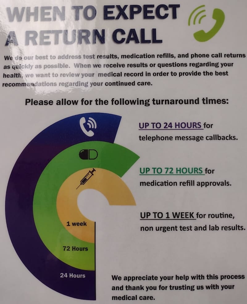
Howie H., sometime contributor to our blog, found this chart in a doctor's office:

Howie writes:
Among the multitude of data visualization sins here, I think the worst is that the chart *anti*-encodes the data; the longest wait time has the shortest arc!
While I waited I thought about a redesign. Obviously a simple bar chart would work. A properly encoded radial bar could work, or small multiple pie charts. But I think the design brief here probably calls for a bit of responsible data art, as this is supposed to be an eye-catching poster.
I came up with a sort of bar superimposed on a calendar for reference. To quickly draft the design it was easier to do small multiples, but maybe all three arrows could be placed on a two-week grid and the labels could be inside the arrows, or something like that. It’s a very rough draft but I think it points toward a win-win of encoding the actual data while retaining the eye-catching poster-ness that I’m guessing was a design goal.
Here is his sketch:

***
I found a couple of interesting ideas from Howie's re-design.
First, he tried to embody the concept of a week's wait by visual reference to a weekly calendar.
Second, in the third section, he wanted readers to experience "hardship" by making them wrap their eyes to a second row.
He wanted the chart to be both accurate and eye-catching.
It's a nice attempt that will improve as he fiddles more with it.
***
Based on Howie's ideas, I came up with two sketches myself.
In the first sketch, instead of the arrows, I put numbers into the cells.

In the second sketch, I emphasized eye-catching while sacrificing accuracy. It uses a spiral imagery, and I think it does a good job showing the extra pain of a week-long wait. Each trip around the circle represents 24 hours.

The wait time is actually encoded in the traversal of angles, rather than the length of the spiral. I call this creation less than accurate because most readers will assume the spiral length to be the wait time, and thus misread the data.
Which one(s) do you like?


