Auditory aid
This effort by the NYT graphics team is breath-taking.
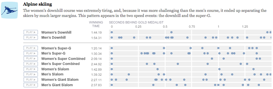
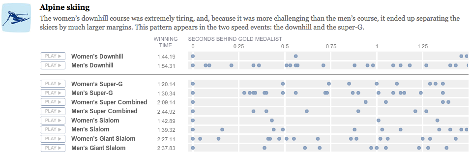
They use dot plots to visualize the closeness of the finishes at many of the Winter Olympics races.
A small improvement is to organize the plots into two columns (men, women) so that readers can compare men and women across a row, and compare different events within a gender down a column.
What really sets this chart apart is the appeal to auditory aid. Click Play and see what I mean.
Fantastic!
Reference: "Fractions of a second: an Olympics musical", New York Times, Feb 26 2010.