Junk Charts
About
RSS
Posts by Year
Posts by Keywords
Sign in
Subscribe
Kaiser Fung
Blogs
Web publishing
Jerome C., a reader and blogger, wrote up a wonderful piece on
Axis
Wannabell
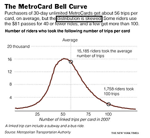
This graph, called the Bell Curve, is a wannabe. The first hint
Axis
Joining the fun
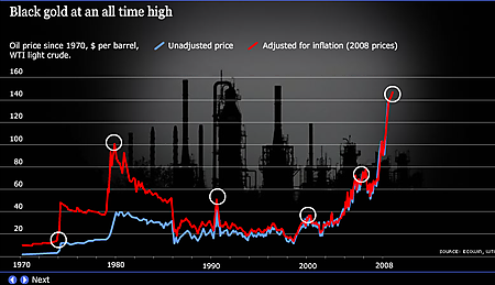
We hope this is indication that the British paper Guardian (with one
Bar chart
Seth on bar charts
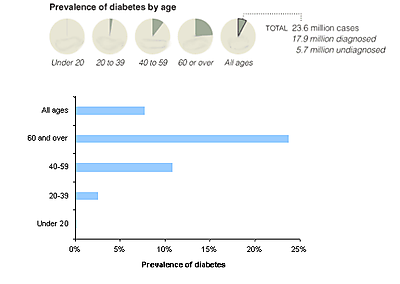
Seth followed up his post about graphics with a specific post about
Business
Right metrics
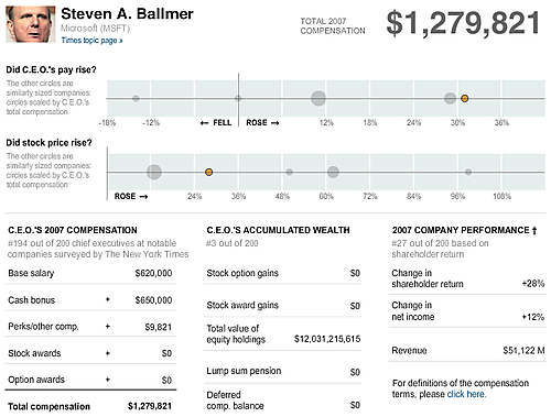
Yesterday's post focused on the purely graphical aspects of NYT&
Axis
Bound to extremes
The New York Times continued to push the envelope by printing super-