Big drops and big dots
Droppings at BLS
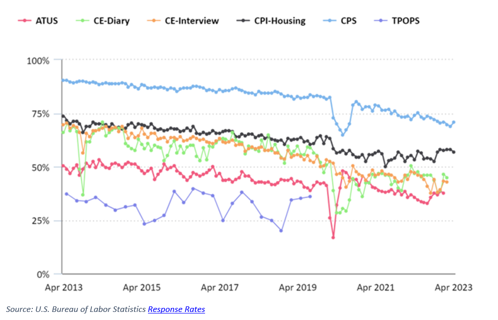
For some unclear reasons, the response rates for various instruments used by the Bureau of Labor Statistics (BLS) to measure the nation's well-being have been dropping . As the above chart shows, the CPS survey (which is used to measure the unemployment rate) are seeing 15% fewer responses than about 10 years ago.
The chart is unnecessarily busy. This combination of dots and line segments curiously elevate the dots above the lines. As a result, the chart spotlights the "noise" in the data series.
Two years later, someone at the BLS noticed this problem, and published a new design, which has definitely improved:
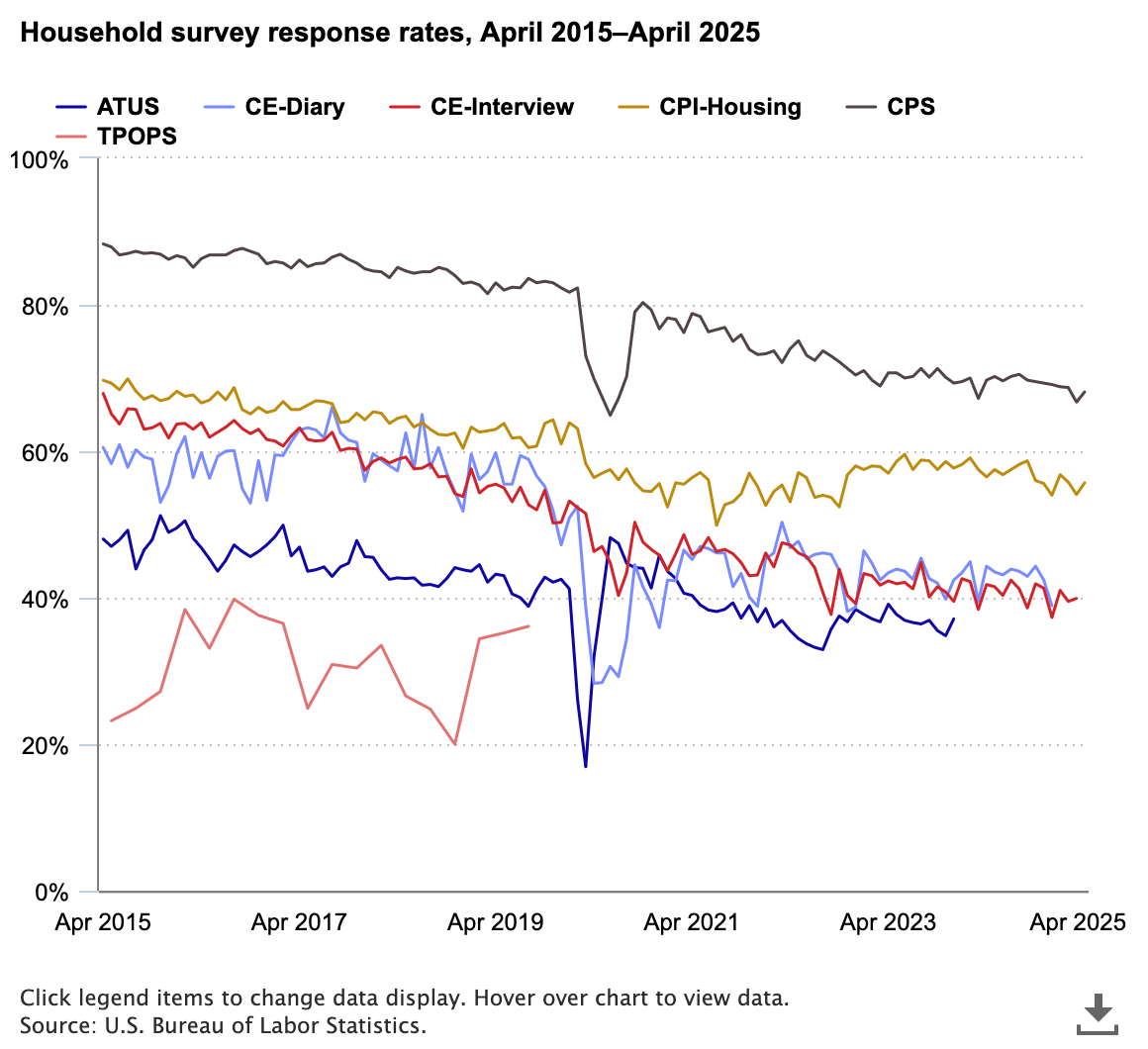
The dots are no longer there, and so they don't steal all of our attention.
Nevertheless, this revised design still lets the background noise drown out the signal.
Besides, you're involuntarily twisting your neck as you work out which color and which line is which survey.
In this revision, I put the dots back but push them to the background. I add a smoothed line for each survey that depicts the downward trend in response rate. The line labels are at the end of each line.
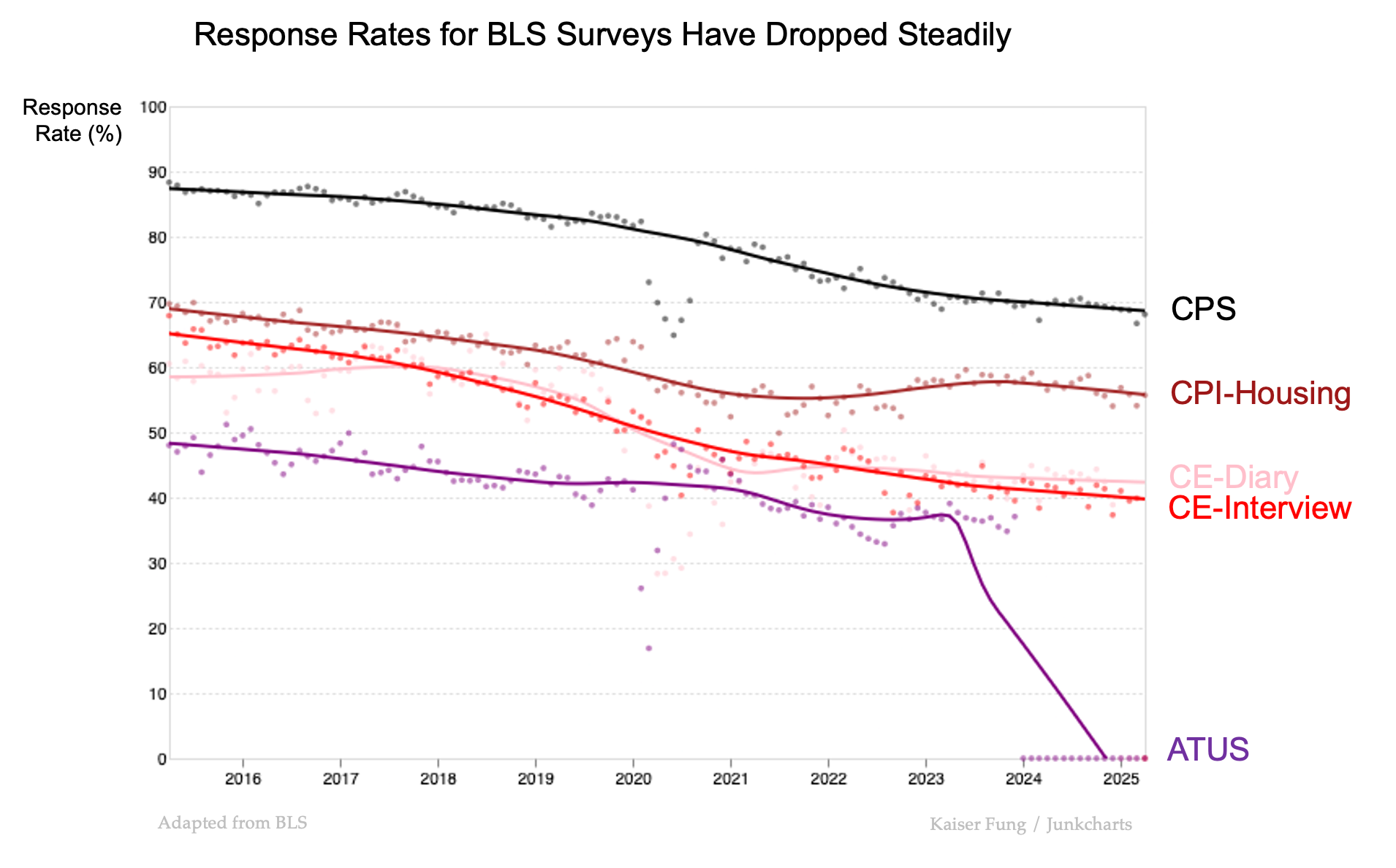
I didn't check why ATUS has zero response since 2024. It might just have been suspended.