Brexit, Bremain, the world did not end so dataviz people can throw shade and color
Pick your own distortion
Catching a dose of Alberto Cairo the other day. He has a good post about various Brexit/Bremain maps.
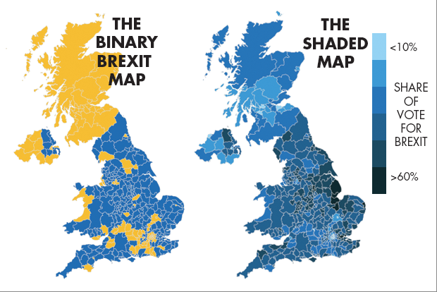
The story started with an editor of The Spectator, who went on twitter to make the claim that the map on the right is better than someone else's map on the left:

There are two levels at which we should discuss these maps: the scaling of the data, and the mapping of colors.
The raw data are percentages based on counts of voters so the scale is decimal. In general, we discretize the decimal data in order to improve comprehension. Discretizing means we lose granularity. This is often a good thing. The binary map on the left takes the discretization to its logical extreme. Every district is classified as either Brexit (> 50% in favor) or Bremain (> 50% opposed). The map on the right uses six total groups (so three subgroups of Brexit and three subgroups of Bremain.
Then we deal with mapping of numbers to colors. The difference between these two maps is the use of hues versus shades. The binary map uses two hues, which is probably most people's choice since we are representing two poles. The map on the right uses multiple shades of one hue. Alternatively, Alberto favors a "diverging" color scheme in which we use three shades of two hues.
The editor of The Spectator claims that his map is more "true to the data." In my view, his statement applies in these two senses: the higher granularity in the scaling, and also, the fact that there is only one data series ("share of vote for Brexit") and therefore only one color.
The second point relates to polarity of the scale. I wrote about this issue before - related to a satisfaction survey designed (not too well) by SurveyMonkey, one of the major online survey software services. In that case, I suggested that they use a bipolar instead of unipolar scale. I'd rather describe my mood as somewhat dissatisfied instead of a little bit satisfied.
I agree with Alberto here in favor of bipolarity. It's quite natural to underline the Brexit/Bremain divide.
***
Given what I just said, why complain about the binary map?
We agree with the editor that higher granularity improves comprehension. We just don't agree on how to add graularity. Alberto tells his readers he likes the New York Times version:

This is substantively the same map as The Spectator's, except for 8 groups instead of 6, and two hues instead of one.
Curiously enough, I gave basically the same advice to the Times regarding their maps showing U.S. Presidential primary results. I noted that their use of two hues with no shades in the Democratic race obscures the fact that none of the Democratic primiaries was a winners-take-all contest. Adding shading based on delegate votes would make the map more "truthful."
That said, I don't believe that the two improvements by the Times are sufficient. Notice that the Brexit referendum is one-person, one-vote. Thus, all of the maps above have a built-in distortion as the sizes of the regions are based on (distorted) map areas, rather than populations. For instance, the area around London is heavily Bremain but appears very small on this map.
The Guardian has a cartogram (again, courtesy of Alberto's post) which addresses this problem. Note that there is a price to pay: the shape of Great Britain is barely recognizable. But the outsized influence of London is properly acknowledged.

This one has two hues and four shades. For me, it is most "truthful" because the sizes of the colored regions are properly mapped to the vote proportions.