Bubbles of death
Thanks to Dustin J for bringing this stupendous chart to our attention. I have to admit I have trouble understanding it. The red curve appears to be part of a gigantic circle confirming that all life do end on this earth. How it is connected to the rest of the chart I am unable to discern. In addition, the trajectory of the bubbles, the overlaps between bubbles, the separation between bubbles all may or may not carry meaning.

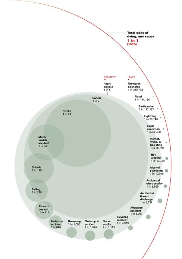
Reference: "What are the odds of dying?", National Safety Council.


