But or because more information
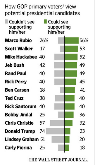
Wall Street Journal uses this paired bar chart to show the favorable/unfavorable ratings of potential GOP candidates for the 2016 presidential elections. (link to original)

This chart form is fine. From this chart, we can easily see which candidates have the strongest favorable ratings. This is precisely how the candidates were sorted (green bars).
But this chart form has one weakness. It's trying to compress three dimensions into one. The dimension of distractors is harder to understand. The gray bars are not sorted, implying that the unfavorable ratings are not well correlated with favorable ratings. There is also a third category (unknowns) that is lurking.
A scatter plot would bring out the correlation between favorable and unfavorable more clearly. In the following version, I coded the unknowns in a green color. The lighter the color, the more unknowns.

Most candidates have somewhat more supporters than distractors detractors. Trump and Christie are clearly in trouble, with more distractors than supporters, and few unknowns (dark green). Fiorina, who just entered the race, is also weak though she could recover by winning over the substantial number of unknowns.
The scatter plot takes more effort to understand but, or because, it conveys more information.


