Calming the rip tide
Xan Gregg at Forth Go helpfully scraped the auto market share data off the NYT chart discussed here before. He even created an improved chart based on histograms.
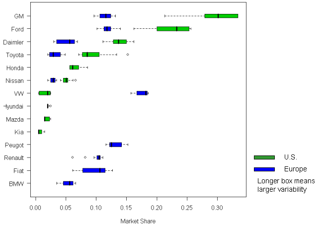
I have created another view of the data, using boxplots. Tukey's boxplot is one of the most spectacular graphical inventions, as I have said before (see here, for example). Its power is evident again for this data set.

This chart is in fact two boxplots superimposed on the same surface. I forgot to put on the legend: the green boxes represent U.S. market shares, and the blue boxes Europe shares.
The automakers are ordered by decreasing U.S. market shares (with apologies to European readers).
Lots of information can be immediately read off this chart:
- The European market is much more fragmented than the U.S. market.
- The Big 2 (GM, Ford) has had mixed fortunes over this period (as indicated by the large variance)
- The Big 2 are competitive in Europe although they are definitely not dominant there
- Several key players in Europe (Peugot, Renault, Fiat, BMW) have negligible shares in the U.S
Most importantly, there is little evidence that the U.S. market is "looking more like Europe".
One weakness of the above chart is the suppression of temporal information: there is no indication whether the recent shares are moving to the left or the right of the medians (center of each box).
In the next chart, with the Europe data removed, I highlighted the data for the most recent 5 years in red. I can make the general statement that there is a small movement towards less concentration and more parity in the U.S. market but one have to conclude that the U.S. market shares in 2000-2006 look more similar to the U.S. market shares in 1990-1999 than to Europe market shares.

P.S. I added legends to the charts.


