Can information be beautiful when information doesn't exist?
What message are you sending to your readers?
Reader Steve S. sent in this article that displays nominations for the "Information is Beautiful" award (link). I see "beauty" in many of these charts but no "information". Several of these charts have appeared on our blog before.
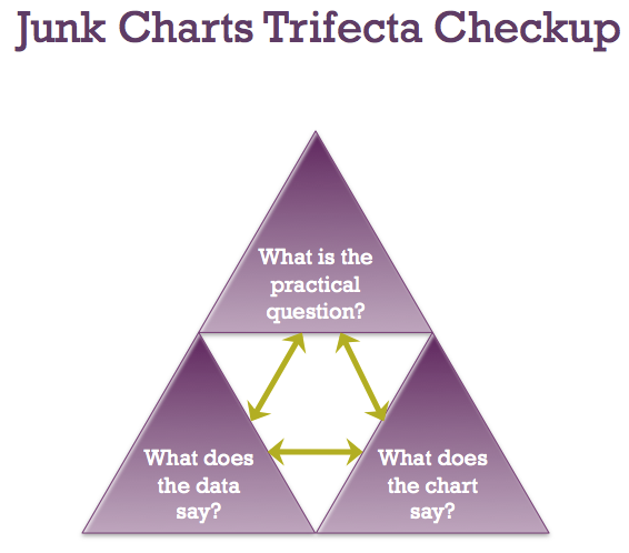
Let's use the Trifecta checkup on these charts. (More about the Trifecta checkup here.)

The topic of this chart is both tangible and interesting. As someone who loves books, I do want to know what genres of books typically win awards.
However, both the data collection and graphical design make no sense.
The data collection problem presents a huge challenge and it's easy to get wrong. The problem is how narrow should a theme be. If it's too narrow, you can imagine every book has its own set of themes. If it's too wide, each theme maps to lots of books. The challenge is how to select the themes such that they have similar "widths". For example, "death" is a very wide theme and lots of books contain it, as indicated by the black lines. "Nanny trust issues" is a very narrow theme, and only one of those books deals with this theme. When there is such a theme, is its lack of popularity due to its narrow definition or due to writers not being interested in it?
***

The caption of this chart said "Cover stars: Charting 50 years up until 2010, this graphic shows The Beatles to be the most covered act in living memory." If that is the message, a much simpler chart would work a lot better.
Since the height of the chart indicates the number of covers sold in that year, the real information being shown is the boom and bust cycles of the worldwide economy. So, a lot more records were sold in 2005, and then the market tanked in 2008, for example.
That's why the data analyst should think twice before plotting raw data. Most data like these should be adjusted. In this case, you could either compare artists against one another in each year (by using proportions) or you have to do a seasonal and trend adjustment. I also don't see the point of highlighting year-to-year fluctuations. Nor do I understand why only in certain years is the top-rated cover identified by name and laurel wreath.
***
I talked about this stream graph of 311 calls back in 2010. See the post here.

***
I featured this set of infographics/pie charts back in 2011. See the post here.

***
This chart is a variant of the one from New York Times that I discussed here. I like the proper orientation on the NYT's version. The color scheme here may be slightly more attractive.