Climate change and duelling charts
Abhinav asks me to check out his blog post on a chart on global warming (I prefer the term climate change) featured on Wonkblog. The chart is sourced to a report by the World Metereological Association (link to PDF).

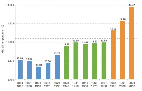
Hello, start the axis at zero whenever you are using plotting columns. That's as fundamental as only plot proportions on a pie chart.
There is a reason why the designer didn't like to start the axis at zero. It is this (Abhinav helpfully made all these charts):

The trouble is that for this data set (on global average temperature), the area below 13 is completely useless. It's like plotting body temperature on a scale of 0 - 100 Celsius when all feasible values fall into a tight range, maybe 35-38 Celsius. I recount a similar situation that led to a college president saying something stupid in Chapter 1 of my new book, Numbersense. (Information on the book is here.)
So we understand the desire to get rid of the irrelevant white space. This is accomplished by using a line chart. (I'd prefer to omit the data values, and rely on the axis.)

Abhinav then created various versions of this by compressing and expanding the vertical scales. I don't think there is anything wrong with the above scale. As I mentioned, the scale should focus on the range of values that are feasible.
Nice work, Abhinav.


