Close races
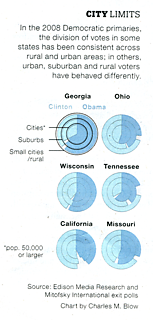

Perhaps harkening to the close race between Obama and Clinton, the designer chose to illustrate this with what we have called the "racetrack" graph. We have previously discussed the problems here and here.

In this rendition, a pie chart was divided into three race tracks with "cities" getting the inside track and "rural/small cities" getting the outside track. (As the Clinton supporters might say, elitism was in the air.) There were two great choices: the courage to not print the data and let the chart speak for itself, and the wisdom to white out the votes for "others".
Nevertheless, as we discussed before, the data is coded into the angles rather than the lengths of the strips, which presents a real problem in comparing vote shares. For example, try figuring out if there were more Obama supporters in rural Tennessee than there were Clinton supporters in cities in Tennessee (bottom right).

Also note where the white "others" space were, and the impossibliity of comparing them.
The arrangement for Wisconsin, meanwhile, posed a challenge for anyone who wanted to estimate how many rural Wisconsin voters went for "others".
In the junkart version, we go with the two-sided bar chart, typically found in population pyramids. The information presented jumps out at you.

This chart is essentially the same as the racetrack; one just needs to straighten out the strips from the original chart, and pull the Clinton ones clockwise, and Obama ones anti-clockwise.
Reference: some recent issue of New York Times magazine.


