Convenience charting
Statisticians have long riled against "convenience sampling", that is, the practice of selecting samples based on what's easily available, not at random. Say picking your friends.

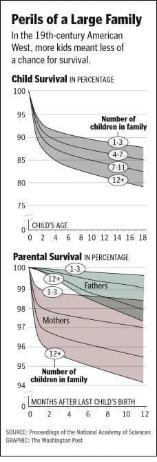
Dustin J sent in this example of what can only be called "convenience charting". Dustin said he had no clue what this chart is saying, and I am not surprised.
The chart plots a statistical object known as the "survival function". It is likely that "survival analysis" was done, after which the chart creator picked up the resulting statistical object and dumped it onto this "convenience chart".
If we take the top line on the "child survival" graph, it shows the probability of one child surviving up to a certain age, if the child belonged to a family with 1-3 kids. The chance is about 92.5% that the child will survive through age 2, and 88% that the child will survive through age 18. The difference between those percentages is due to the chance that the child may die between ages 2 and 18.
A slight transformation of the data will make this point much clearer. What is the probability of a child dying by a certain age? Using the example, a child has 12% chance to die by age 18, and 7.5% chance of dying between ages 0-2.

The junkart chart depicts this probability. (I reverse-engineered the data which explains why the distances between the line segments look strange.)
What this chart doesn't address is how we are to interpret the probability of "a child dying" in a family with more than one child. Is it a random child dying? At least one child dying? Exactly one child dying (the other X-1 surviving)?
The original chart also committed a number of standard errors. The child survival function represent probabilities, not percentages. The third category should be 8-11 kids, not 7-11. If we are picky, then we would also like to see "confidence intervals" because there must have been many fewer families in the 12+ sample than the 1-3 sample. In the second chart (which I don't have space to discuss), some data labels are missing, which indicates a presumption that all readers have seen the first chart.
Reference: "Child, Parents Drive Each Other to Early Graves", Washington Post, Jan 14, 2007.


