Cousin misfit
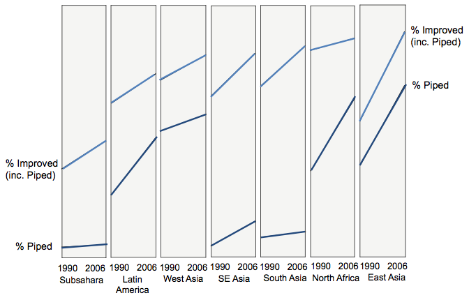
Stef, who had a hand in the inkblot charts that many loved, sent in the following chart, with the note that he hasn't seen these line/area charts before.
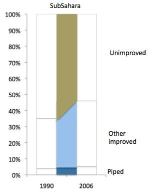
This chart is interesting indeed. The objective of the chart is to compare the state of drinking water in different regions of the developing world. It tries to emphasize the amount of improvement attained between 1990 and 2006.
I can't quite figure out how the regions are ordered. It's not by any of proportions depicted in the chart, nor position on the map.
Next, with the areas catching much attention, I wanted to figure out what the areas mean.
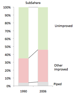
To help in this exercise, I computed the key piece of information, i.e. the increase or decrease in proportion of each water source, and placed on in each piece of area, as shown below.

Based on this evidence, one has to conclude that the area has nothing to do with the change in proportions over time. The brown areas (unimproved sources) are negative changes while the blue and light blue areas are positive changes. Negative area is not a visually depictable concept, unfortunately.
Also, note the dark blue areas of Latin America vs Western Asia. The Western Asia one is a bit larger than the Latin America but the change in proportions is exactly the reverse, 7% against 23%.
Is this a new type of chart? It took me a few days to figure it out.
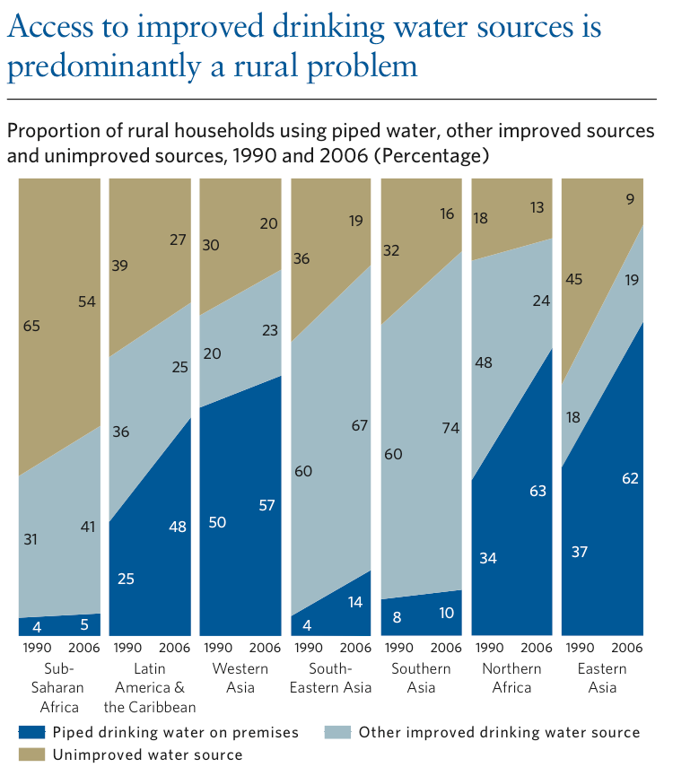
How is the following chart related to the above chart?
The original chart is a cousin misfit of the above chart, as we can see below.
The key piece of data is embedded in the slopes of the connecting lines, and this cousin of the column chart with connecting lines draws our attention away from those lines and to the areas. The colored areas are in no way proportional to the slopes of the connecting lines and so the information has been distorted.
Nice-looking chart but needs rethinking.
PS. Some commentators seem to think that I suggested that the paired column charts would be a better alternative than the original. No -- I am using charts to analyze charts. An improved chart would be like the following, in which the areas are de-emphasized in favor of the lines. (Please imagine the vertical axis.)