Dispute over analysis of school quality and home prices shows social science is hard
Most of my friends with families fret over school quality when deciding where to buy their homes. It's well known that good school districts are also associated with expensive houses. A feedback cycle is at work here: home prices surge where there are good schools; only richer people can afford to buy such homes; wealth brings other advantages, and so the schools tend to have better students, which leads to higher test scores.
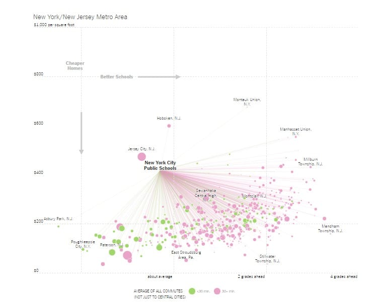
A few weeks ago, the New York Times Upshot team ran some visual analytics to illustrate the correlation between school quality and home prices (link). Good for them, they went beyond a simple bivariate analysis. They also added commute time to the mix. The primary concern appears to be comparing so-called central cities with their suburbs in their respective regions. Some of these suburbs have better schools but the commute times are on average higher. Is it worth it to move to such neighborhoods?
This article has attracted much controversy. Alexander Russo summarizes some of the complaints here. The key objections cited in his report are as follows:
- using test scores as a proxy for school quality is simple-minded
- no accounting for other important variables such as demographics, backgrounds and so on (i.e. no attempt to control for other variables)
- not causal: no one believes that moving a randomly selected student from a "bad" district to a "good" district will cause his/her test scores to jump by say two grade levels
- using grade equivalent units which no one can understand
There are also complaints about the visual design. I will have some comments in a separate post on the sister blog. (The post should be available soon after this post goes live.)

***
I think #2 and #3 above are very important caveats. Point #1 is definitely a concern but critics admit that there are no great proxies. I will get to Point #4 below.
For me, the biggest issue is something missing completely from the original analysis: what decision scientists call the "indifference curves". What underlies this analysis is the assumption that families are making trade-offs between commute times, school quality and home prices. An indifference curve makes explicit what these trade-offs are: for example, how many more dollars per square feet is someone willing to pay in order to send kids to a school that is one grade level above another school? These curves are generally not linear. The value of moving from 3.5 to 4 grade levels is not as high as that of going from 1.5 to 2 grade levels, even though both shifts are precisely half a grade.
Once these trade-offs are in focus, we see the relevance of complaint #2. In the New York area chart, shown above, almost all of the districts are in the lower right quadrant relative to NYC, which means that a lot of districts on average have higher test scores and lower home prices than NYC. So, if those two factors were the primary reasons for selecting where to live, then no one would rationally choose to live in NYC! The addition of the third factor indicates that commute time may be another key consideration. Is commute time able to explain all of the data? That's not something easy to see from this chart, especially when commute time is reduced to two levels (under/over 30 minutes) and encoded in the colors.
***
The test score data came from the Stanford Education Data Archive (link). After you give them your email address, you will find a note saying that one standard deviation is roughly three grade levels. This raises a different kind of issue! Are the differences plotted on the chart meaningful? Usually, meaningful differences are at least two standard deviations, which would be six or more grade levels.
"Grade level equivalent" is a complicated concept. The same test is administered to students of different grades, so for example, the 5th-grade test is given to students in 3rd, 5th and 7th grades. The average scores of 3rd, 5th and 7th graders are computed. These are then mapped back to the 5th-grade scale. Anyone in 5th grade who scored above the average 7th grader is said to be two grade levels "ahead".
The fact that one standard deviation equals three grade levels tells me that the score distributions of 5th graders and 7th graders taking the 5th grade test overlap substantially. It seems likely that the difference between the 5th and 7th grader is not statistically significant - which, if true, is a sad commentary on our education standards.
Back to the chart above. If my interpretation based on the note from the Stanford Eduaction Data Archive is correct, then almost all of the horizontal differences on the NYT charts are practically meaningless.
***
Now, click here to read my comments on the data visualization.