Dizzy display
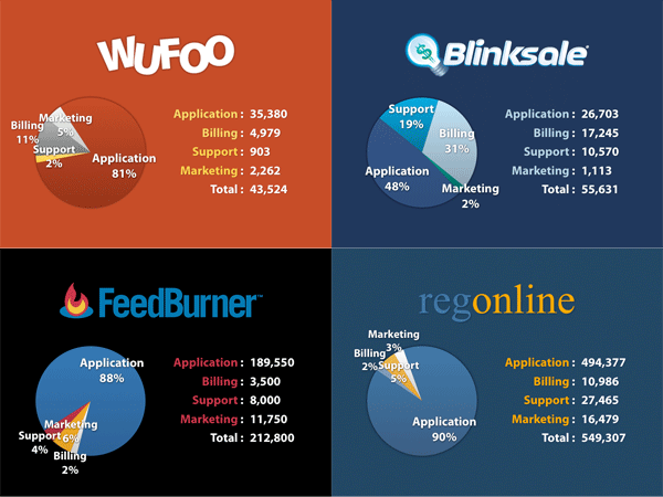

Xan G. tells us that these "inconsistent pie charts ... make [his] head hurt". The dizzy array of colors is unfortunate, especially when "Application" gets a medium blue in three of four pies but an orange-red in one of them. Just like the baby names charts, it's important to keep the background constant when constructing small multiples.
We cite from the horse's mouth:
The goal of this section was to uncover any [software development] task that might be overlooked [by these startup companies]. When writing a software product, the tendency is to focus 100% on the application. Items like support, marketing, and especially billing never cross your mind.
The junkart version below is designed to bring out this one message: that Blinksale has distinguished itself from the rest by having spent more time developing code for purposes other than the application itself.

I removed the raw counts of lines of code and focused only on the relative proportions. The former does nothing to argue the author's case.
The pie charts fail our self-sufficiency test. The reader must rely on the data table and data labels to understand the chart. If removed, the key message is obscured.
Source: "Web App Autopsy", ParticleTree, June 2007.


