Does it make sense?

There is nothing wrong with the way this chart is constructed. I'd probably have the labels all set to the right in a column but otherwise, no real issues.
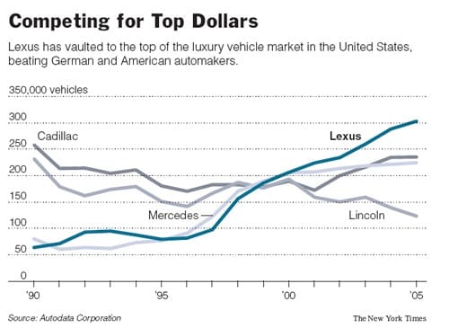
However, this chart bugs me in another way. I just cannot make sense of it. The year 1999 appears to be some kind of watershed year for these 4 automakers: they roughly split the market that year. It is very strange that all the lines would meet at a point and then spread out again. It seems very unnatural. It makes me wonder if we are looking at bad data. Anyone have access to the underlying data or knowledge of what kind of watershed was 1999?
Reference: "An Ambitious Lexus Takes On the Europeans", New York Times, April 15 2006.


