Dot plots are under-valued, that's all
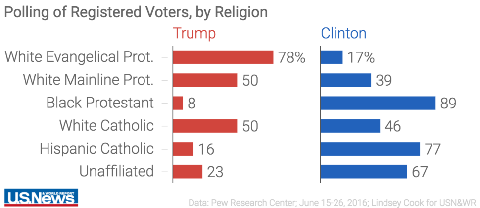
Bar charts are over-used and over-rated. Just casually, I found this example at US News:

Are you comparing bar widths? Or the printed data?
Here is a dot plot:

Bar charts are over-used and over-rated. Just casually, I found this example at US News:
Are you comparing bar widths? Or the printed data?
Here is a dot plot:


