Excel is the graveyard of charts, no!
Kaiser Fung, creator of Junk Charts blog and founder of Principal Analytics Prep, encourages Excel users to work harder at making nice data graphics.
It's true that Excel is responsible for large numbers of horrible charts. I just came across a typical example recently:

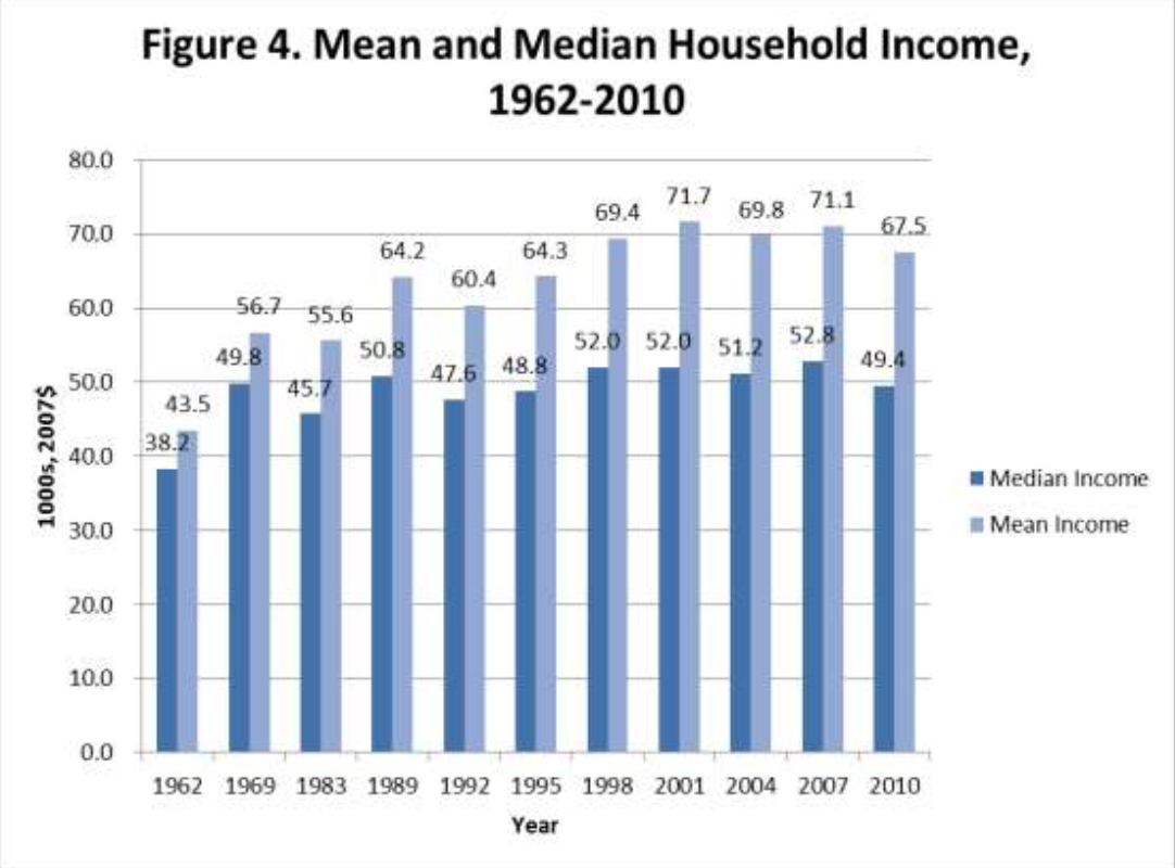
This figure comes from Edward Wolff's 2012 paper, "The Asset Price Meltdown and the Wealth of the Middle Class." It's got all the hallmarks of Excel defaults. It's not a pleasing object to look at.
However, it's also true that Excel can be used to make nice charts. Here is a remake:

This chart is made almost entirely in Excel - the only edit I made outside Excel is to decompose the legend box.
It takes five minutes to make the first chart; it takes probably 30 minutes to make the second chart. That is the difference between good and bad graphics. Excel users: let that be your inspiration!


