Facetune your charts
The art of sacrificing precision
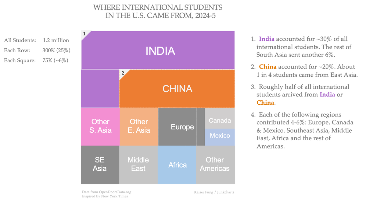
In a prior post, I featured the above chart to tell the story of international students in the U.S.
The story told by this chart is clean. Divide the total into two halves: the first half are the Indian and Chinese students; the other half comprises everyone else. Within the top half, India has 5/8 to China's 3/8. The bottom half is spliced into 8 parts. Europe is one, Canada+Mexico has one, the rest of the Americas occupy one, etc.
As I write this, I can hear purists screaming in my ears. "Your chart distorts the data", "You're spreading misinformation".
I confess. The chart is, for lack of a better word, face-tuned.
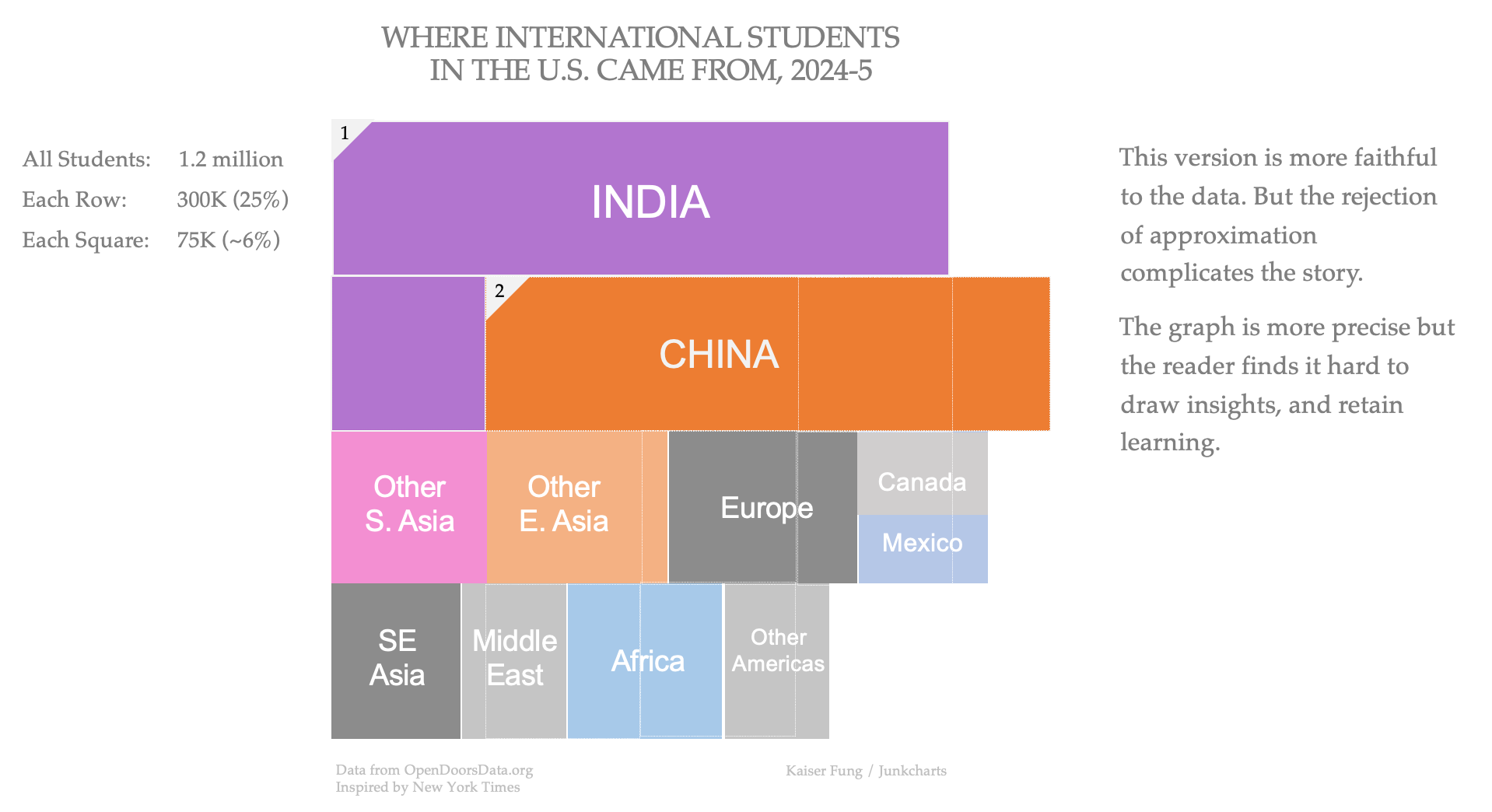
Below is the version of the chart that is "faithful" to the dataset:
India and China together made up 53% of the total, more than the 50% shown in my preferred version.
The eight country groups contributed between 4 to 8 percent of the students, not exactly 6 percent as my preferred chart suggests. To be precise: Europe 8%, East Asia (excluding China) 7%, Africa 6%, South Asia (excluding India) 6%, Canada+Mexico 5%, Southeast Asia 5%, Middle East 4%, and Americas (excluding Canada+Mexico) 4%.
The question: is the "faithful" version better than the "approximated" version?
If my goal is for readers to walk away with insights that they can pass along to others, then I don't hesitate to use approximations.
If the readers thought the sum of Indian and Chinese students made up 50% of the total (rather than 53%), what is the harm?
If the readers thought that Europe, Middle East, Southeast Asia, etc. all contributed equal shares of international students - and they would be adrift by a few percentage points one way or the other, is it worse than them trying to recall which region had 8 percent, and which region had 5 percent?
Our brains are not designed to hold raw data. This is why we don't want to - and can't - remember passwords that are long strings of randomly selected, alphanumeric characters. This is also why rejecting approximations is frequently harmful. Face-tuning your charts is often beneficial!