Failed university education

The Times Higher Education magazine fancied itself an arbiter of good universities and yet they appeared not to have heard of Tufte, or know why we should not use 3-D pie charts, ever.
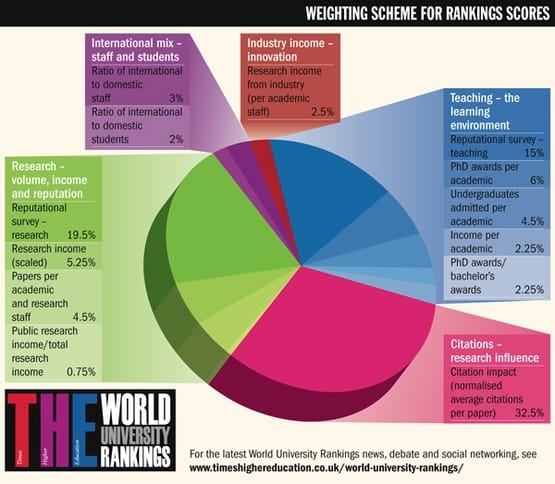
Reader Cedric K. sent in this chart, with a note of dismay. Quick, which is most important: the pink, the blue or the green?
***
Something like the stacked bar chart shown below delivers the information more effectively. The section showing sub-categories can be omitted.

If, in fact, it is crucial for the readers to know each weight to the second decimal, then why not just print a data table? The beauty of just using a data table is that it can accommodate long text strings, which are needed in this case to explain clearly what the subcategories actually mean.
If one wants bells and whistles, one can add little bars to the right of the proportions to visualize the weights.


