Following one's nose 1
Andrew Gelman has a great post about a so-called Immigrant paradox here, which should be interesting to our readers too.
He posed a set of sharp questions. My read, in reverse order:

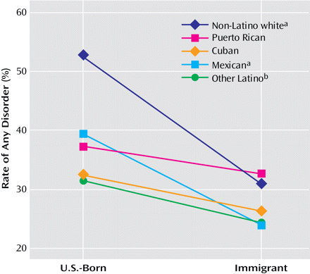
6. The graph is pretty effective, I agree. This is known as an "interaction plot". The message the authors were trying to send was that the gap between immigrants and U.S. born in terms of prevalence of mental illness is not constant across sub-groups of Latinos. For example, the gap for Mexicans (light blue) is larger than the gap for Puerto Ricans (pink). Thus, the authors concluded that one should be careful about speaking of an aggregate (average) gap.
The graph lays this out clearly. The steeper the line, the bigger the gap between the immigrants and non-immigrants.
When Andrew showed this, I knew for sure someone will cry foul that a line is drawn between unrelated, discrete things. Indeed, the very first commenter weighed in with this complaint. In fact, whenever I show such charts to non-statisticians, a lot of people have this reaction.
So I'll take this as another chance to convince you to release interaction plots from jail.
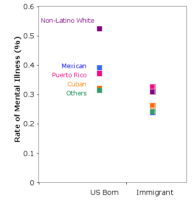
Typically, a dissenter will offer up a dot plot as an alternative. So let's look at the same chart without the lines. Since the reader is supposed to figure out how the gap between U.S. born and immigrant groups across different subgroups of Latinos, the proverbial nose is tracing a line from a left dot to a right dot. Thus, to follow one's nose is to mentally draw the lines I just removed. The chart designer has done us a favor by making the lines explicit.
In addition, as Andrew pointed out, it is always better to try to get rid of the legend and put the line labels directly onto the chart.
One shortcoming of the interaction plot is that it does not disclose the relative importance of the different lines, which correspond to the relative proportions of people in these subgroups. Without this information, the reader will likely assume the lines have equal weight. This assumption, as I will explain in a future post, may be a problem.
This post dealt with the graphical aspect. I will have more to say about Andrew's other points on the statistics in a future post.


