Foodies say, add dataviz spice please
Kaiser Fung, founder of Junk Charts and Principal Analytics Prep, explains why the Venn diagram is not easy to read, and discusses some nice interesting food and beverage menus.
This Buzzfeed article proves that foodies love their food served with dataviz (tip: Chris P.). Menus are an undertapped resource when it comes to data visualization.
There are several examples worth discussing.

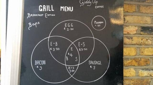
Venn diagrams are not easy to read, people.
Plus they are hard to construct well... note the asymmetric areas.
Here is one without circles:

Then, I pared it down to its essence:

***
This beer map is pretty great:

Some of its virtues:
- The spacious layout utilizing two dimensions, instead of a one-dimensional list of dense text
- Ordering using two dimensions relevant to the decision problem (assuming those two dimensions are the most important for their clients)
- Unconventional, attention-grabbing
- More equitable: different readers will read the chart in different orders. I'll hypothesize that they will end up with a more even distribution of drink orders than with a list in which everyone reads top to bottom
Potential problems:
- Not enough space to explain the drinks. Don't the clients want to know what's in them?
- I wonder how they measured the degree of "classic"-ness.
***
This next menu contains an error:

When the drink comes in one size, only one price is listed. If it comes in two sizes, two prices should be listed.
Is the cafe owner shading Americans as not good at math?


