Forced roommates, favoritism, and more in data visualization
Why is this dual-axes chart so taxing to read?
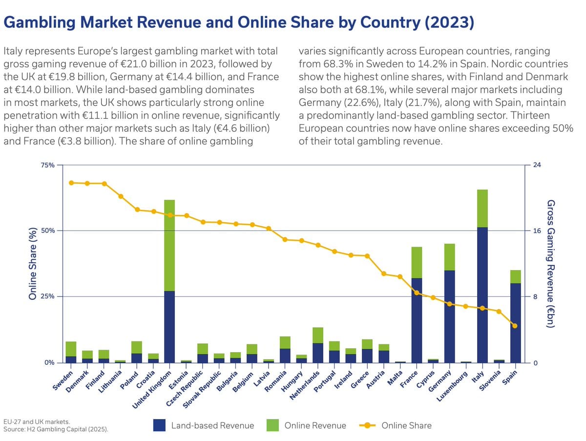
Long-time reader Antonio R submitted the featured chart shown above.
From a visual perspective, the chart is overly ambitious.
It uses dual axes, which is almost always a bad idea. The left-aside axis is related to the orange line, which depicts the "online share" of gambling revenues within each country, expressed as percentages. The right-side axis concerns the stacked columns, which display each country's total gambling revenues, split by online (green) versus offline.
What are the reasons why this chart is mentally taxing?
Dual axes
How is the reader supposed to figure out which axis pairs with which chart? The two axis titles are "Online share (%)" and "Gross Gambling Revenues (€bn)". We'd have to move our eyes to the bottom of the chart, read the legend text, and then mentally connect those with the axis titles. The "online share" gives us the first hint, then we presume that the "land-based revenue" and the "online revenue" must be the components of "gross gambling revenues". Without that legend, we'd have been lost.
Redundancy
The online shares of revenues depicted in orange refers to the green sections of the columns. The orange and green objects are re-scaled versions of the same revenues. Use the same color to represent the same quantity.
Stack order
Given the focus on online gambling revenues, the green sections of the column chart should be placed at the bottom of the columns. The bottom layer of a stacked column chart is the only layer with a uniform base, making it the easiest to read.
Forced roommates
Notice that the two axes share the same set of gridlines. Because of this arrangement, it is as if 50% equals €16 bn. That would be true if the two data series were re-scaled versions of the same underlying data but on this chart, the "Online share" is a re-scaled version of one component of "Gross gambling revenues", and therefore they represent different data. Since the total revenues vary by country, 50% share maps to a different amount in each country so there does not exist a set of gridlines that can meet the desired sharing objective.
The graphing software has taken on the hopeless role of assigning roommates. It wants gridlines for both axes but having two sets of competing gridlines would kill many brain cells. It decides to make the early-rising athlete share a room with the night-owl hacker; they are just going to have to make it work.
How does the software designer decide where to put the shared gridlines? One way is to fix the grid of the primary axis (left-side). This sets the number of lines on the chart. Now, choose a scale for the other data series so that the grid labels on the secondary axis are the "least ugly".
No matter what the designer does, the final gridlines serve one side better than the other.
Favoritism
The gridlines favor the orange series, and so does the sorting of countries.
When you have two data series, you can sort with respect to one series, not both (unless they are perfectly correlated in rank). In the featured chart, the countries are sorted by the online share of gambling revenues.
This sorting scheme arranges the other data series awkwardly, as it turns out, four of the top five markets have seen low online penetration. Italy, the largest market, ends up on the right side of the chart.
If you pay attention to the green sections only, you'll learn that the online segment in Italy (in terms of Euros) is still the second largest behind that of the U.K. The peculiar sorting scheme highlights five countries that have small gross gambling revenues.
There is a good story behind this data. The top markets are much larger than the rest; most of these countries (except the United Kingdom) are stronger in offline than online segments.
In a future post, I'll offer an alternative view of this dataset.
P.S. [1/7/2026] Next post is here.


