From fellow readers

Have been getting a lot of reader suggestions lately. Thanks to all of you! Some of these, for various reasons, I won't be able to write full posts on. But they are still worth looking at.

Julien D. invites us to interact with a different community, graphic designers -- that's graphics as in fine arts, not statistical charts. This is a great post concerning how they would re-design boarding passes. This is akin to Ed Tufte's effort to re-design bus schedules.
While there is no statistics involved in these designs, the virtues of clean, simple, direct communication of data to people still apply. Pretty is also desirable.
***
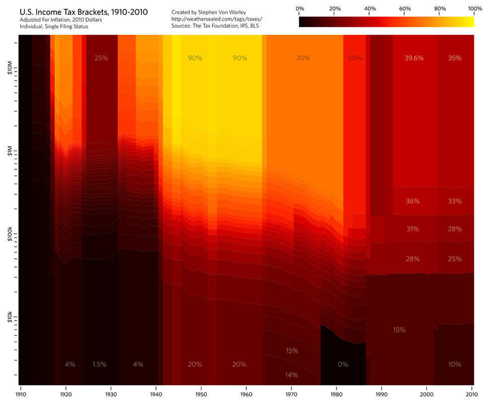
I first saw this infographics of U.S. tax brackets on Felix Salmon's twitter feed (he found this "pretty".) Now, it landed in my inbox via Troy O. My reaction to Felix was "pretty but pointless". Sunset through a smoky lens? Impressionist painting? Scatter plot? Density plot? This one is crying out for your comments.
***
Julien D., same person as above, also pointed us to an animation of the re-birth of European air routes after the volcanic ash scare. (Vimeo link)
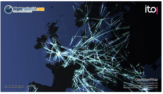
For this sort of exercise, my main interest lies in admiring the behind-the-scenes effort to collect the data, clean and process the data, code the graphics and animation. I'm not sure the animation tells us anything we don't know by reading the news.


