From light to heavy
Yesterday's post led to a number of dissenting comments. Some readers think the charts should be treated as serious works, and they also feel that there is nothing wrong with using the average as the reference level. When I first saw these, I appreciated the effort of the site to mine and analyze the data and wanted to enjoy them as amusing diversions. Well, since you demanded it, this post contains some heavy stuff.
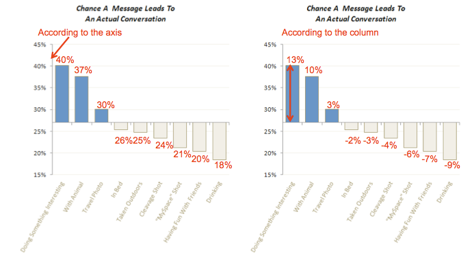
On these charts, I side with Aleks who submitted them. First, there is a mismatch of the axis with what is actually being plotted. On the left side, I printed the data according to the vertical scale, and on the right, I printed the data according to the area/height of the columns (the differentials relative to the average). If the reader reads from the vertical axis, she will be reading out data that do not map to the height of the columns.
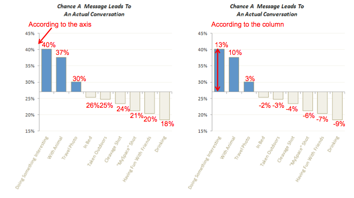
Also notice that as the gray bars increase in height, the axis on the left chart tells us the percentages decrease. The largest number (26%) corresponds to the shortest column. This sort of mismatch makes people dizzy!
As a rule, the scale should agree with what is in the plot. It would not be a problem if the new scale were to be a mere shift of the old one. For instance, I like to label my log-scales with the original data as opposed to 1, 10, 100, etc. However, the following chart shows that the two scales in question (absolute, relative) are not a mere shift in location... for categories above average, they plotted X - average, while for categories below average, they plotted average - X. This is the source of confusion for Aleks and myself.
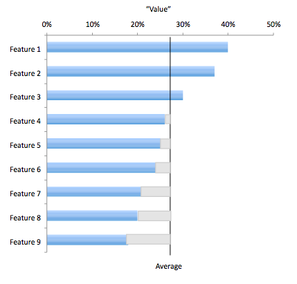
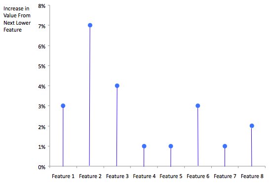
Secondly, there is no reason why the average level need be the dividing line between the blues and grays. In fact, looking at the bar chart above, one might ask whether the top 2 categories belong together, rather than the top 3. One way to determine the right clustering of categories is to look at the increase in "value" from one bar to the next higher bar. The chart below shows this data, and it's clear that there is a large increase between the second and third categories. Thus, it would make more sense to put the dividing line between 2 and 3.
And finally, I agree with Andrew that the chart is much better just by turning it sideways so that there is room for the text labels.


