Get your automated Junk Charts clone
I'll now haunt you every minute of every day
Prof. Hill at Samford University posted several class projects to Linkedin, which is more than amusing. The students made clones of Junk Charts critics, using the Junk Charts Trifecta Checkup framework.
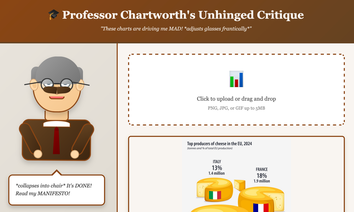
Professor Chartworth (link), by Mary Hodges, is cheeky and irreverent. I threw in the cheese chart that recently showed up on the blog.
The AI (it's Claude behind the scenes) gave this answer:
📋 1. WHAT IS THE QUESTION?!
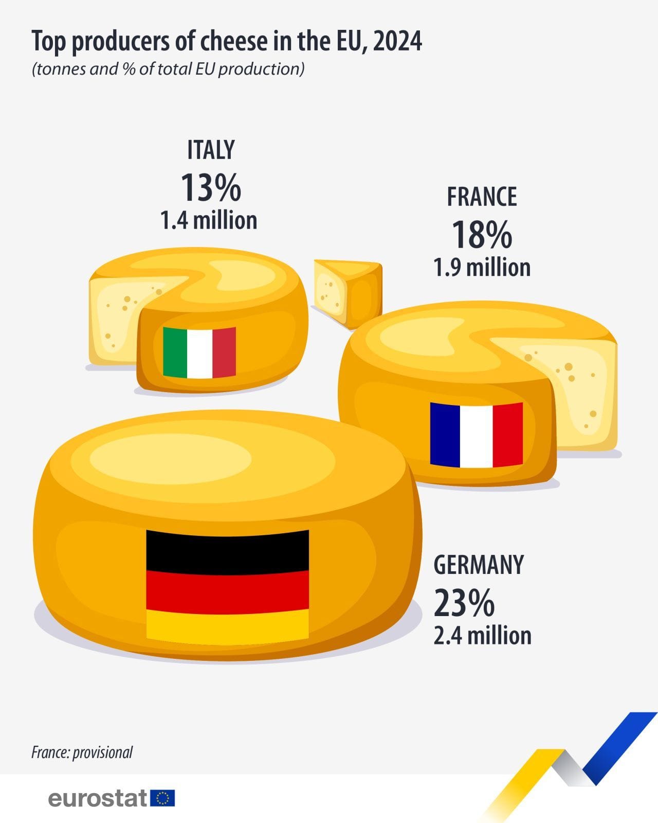
*adjusts glasses frantically* Oh, OH! Finally, FINALLY a chart that actually answers a clear question! Who are the top cheese producers in the EU? It's right there in the title! *wipes tear* I'm... I'm not used to this level of basic competence. Is this what normalcy feels like? I need to sit down.
📊 2. WHAT DOES THE DATA SAY?!
*nervous laughter* So Germany makes 2.4 million tonnes and gets 23%, France makes 1.9 million and gets 18%, and Italy makes 1.4 million and gets 13%... BY TUFTE'S GHOST, THESE THREE COUNTRIES ONLY ACCOUNT FOR 54% OF EU PRODUCTION! *screams internally* WHERE ARE THE OTHER 46%?! The Netherlands is probably sobbing in a corner with their Gouda, completely excluded from this cheese triumvirate! This is like showing a podium but forgetting to mention there's an entire stadium of competitors we're ignoring!
🎨 3. THE VISUAL CRIMES!
WHO APPROVED THESE PROPORTIONALLY INCORRECT CHEESE WHEELS?! *flips table* The German cheese wheel is MAYBE twice the visual area of Italy's, but it should be 1.7x based on the actual tonnage! In my 47 sleepless nights of measuring cheese illustrations with digital calipers, I've never seen such a flagrant violation of the sacred principle of proportional representation! And don't get me STARTED on how they're all the same shade of yellow-orange like some kind of processed American singles fever dream—where's the visual distinction?! It's like they asked an AI to draw 'generic cheese' and called it a day! *collapses dramatically* The only thing saving this from complete disaster is that at least—AT LEAST—they labeled the actual numbers clearly. Small mercies in this dairy-based nightmare.
Not bad, eh? (Compare to my writeup here.)
Professor Chartworth does a great job maintaining a certain style. The content is better than I could have expected. Call me impressed.
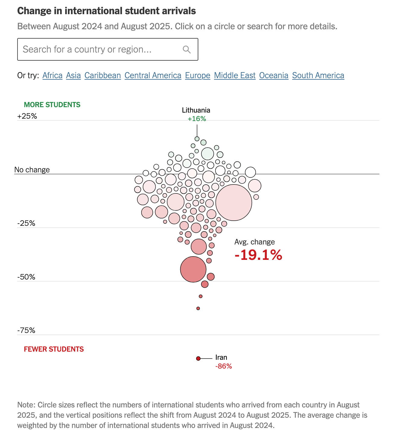
The framework can also be used seriously, as demonstrated by Larkin Camp's project (link). I test-ran it using this New York Times production:
This no-nonsense critic implements my "type" classification, which pinpoints the directions of improvement. It also provides a type summary, like this:
Critique Type: Type V
The visual design needs improvement, but question and data are good.
This visualization addresses a clear question with appropriate data but suffers from poor visual design choices. The beeswarm plot prioritizes aesthetics over functionality, making it nearly impossible to identify specific countries or understand patterns without extensive interaction. The design would benefit from a simpler, more readable format that allows viewers to quickly grasp both individual country performance and overall trends.
It correctly recognizes the "beeswarm" design, and its weaknesses.
Prof. Hill also features Hudson Hyneman's application. Check it out here.