Getting metrics right is half the battle
Learning from some student projects
I've had a chance to look at some class projects from Ray Vella's NYU class recently. I've featured work from prior classes on this blog before (link).
The project objective is to improve a chart on income inequality published by the Economist.
This term, I was most interested in two solutions that involve rethinking how inequality should be measured.
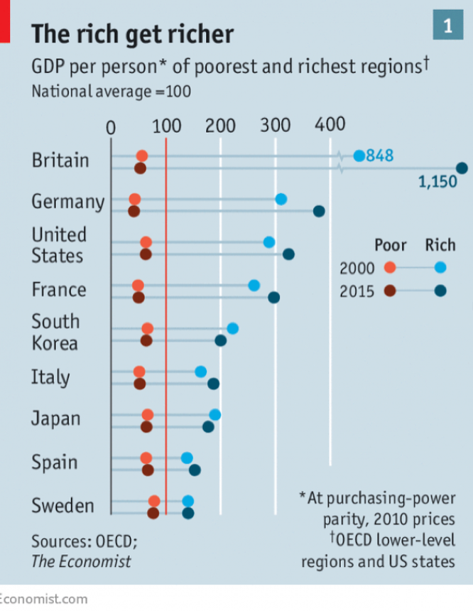
One of the most confusing parts of the Economist original chart is the unit of measuring inequality. You see the data labels 848 and 1,150 up top, and it's puzzling what those numbers mean. The subtitle claims the data concern "GDP per person": are they expressed in British pounds? 848 pounds would be too little, but 848,000 pounds could be too high, but then the blue dots represent "the rich," and if they mean the "super-rich," it might not be large enough.
The answer is None of the above. Following the asterisk, the reader learns that the GDP per capita data have been adjusted. You'd have to know enough about economics data to see that "at purchasing-power parity" implies that all values are US dollars.
Swapping pounds for dollars, I'm still perplexed in much the same way. No text suggests that I should add 000 to these units. That's when one has to return to the titles, and notice "National average = 100".
The plotted data are evidently index values, with the national average set to 100. 848 is 8.48 times the national average while 1,150 is 11.5 times the national average.
Strictly speaking, the plotted data reflect the values relative to the national average in each year. The national average for the U.K. is 100 in both 2000 and 2015 even though the average in pounds for 2015 is surely quite a bit higher than the average in pounds for 2000.
The point of taking you down this dark tunnel is to demonstrate how much work it takes to explain to the reader how the designer has transformed the data, and to convince you, hopefully, not to venture into the dark side.
[To really explain it fully, I'd need another blog post because the above description is still missing one important piece.]
The first of the student work, by Thomas Carlson, reverts to more conventional measures of income inequality. (He submitted several views, one of which I'm discussing here.)
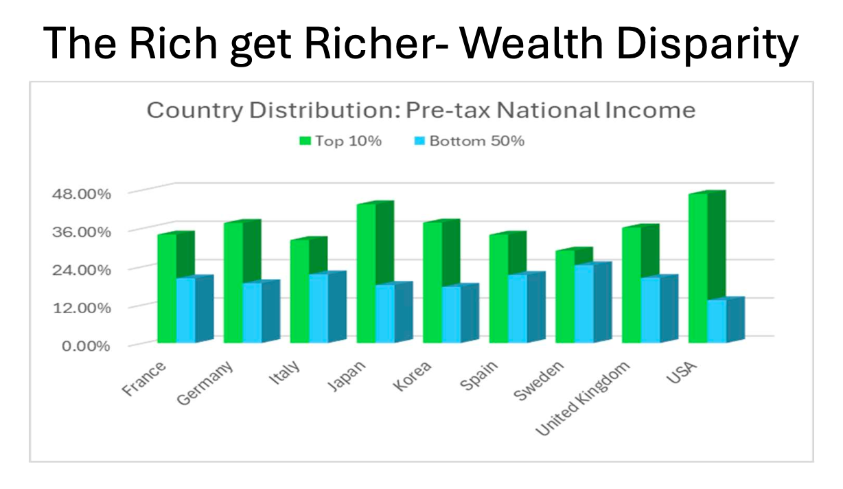
The rich is represented by "top 10%" average pre-tax income; the poor, by "bottom 50%" average pre-tax income. This pair of metrics is much easier to understand. The poor are the bottom half of the distribution, i.e. below the national median.
The vertical axis shows percentages. Instead of showing what their average income is in dollars, which is also hard to interpret without comparisons, he's showing what proportion of the nation's wealth each group comprises. Taking USA (on the far right) for example, the top 10% of Americans hold almost half of the nation's wealth while the bottom half of Americans own just 12%. (By inference, the other 40% of the population have roughly 40% of the wealth. An interesting symmetry is revealed in this data.)
By Thomas's metric, the U.K. is not particularly remarkable. This underlines the point that units of measurement/definitions of metrics matter a lot.
Thomas improved the chart a lot by addressing what I call a Type D problem, in the style of the Trifecta Checkup (featured in this recent post). He also changed the chart form (a Type V problem).
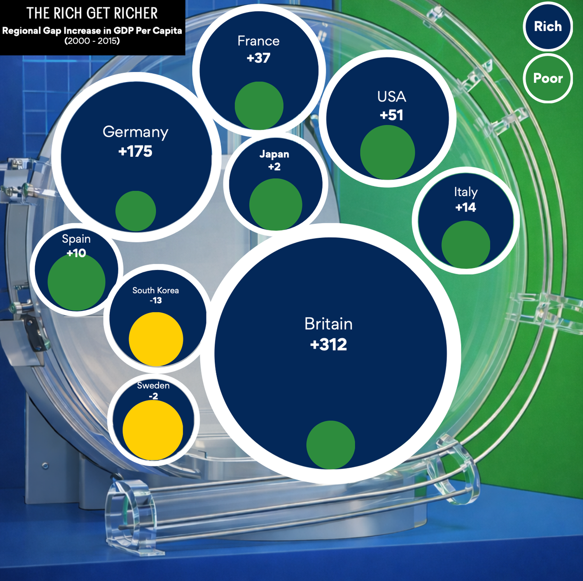
From a visual perspective, the most striking effort was the work by Alexis Duhaney.
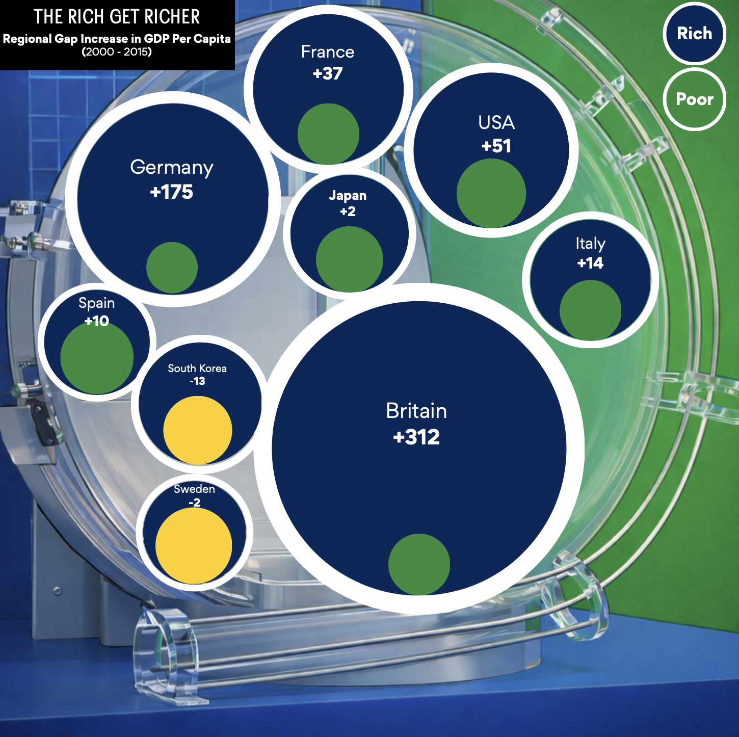
She used circular areas instead of bars to visualize the data. Each country's situation is depicted by two numbers, one each for the rich and the poor. Each number is a pre-post change in the underlying measure of wealth.
The underlying metric is taken from the original Economist chart, so it would take a day and a half to explain it to readers. But the instinct of expressing a pre-post change is a sharp one. One can switch to Thomas's metrics, as an example. As such, the underlying metric becomes the change in share of pre-tax national income.
The visual appeal of this circular design is beyond question. Switching to circles introduces a whole set of issues, which I'll cover in a separate post.