Glass Half Full
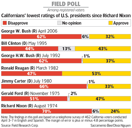

There are many reasons to commend this data graphic, from the Sacramento Bee, including:
- Putting the no opinion group in the middle so that readers can compare the disapproves and the approves directly, utilizing both sides of the vertical axis
- Sensible omission of either axes, since the relevant data have already been printed on the chart
- Effective use of color
- Good spacing in the legend to coincide with the bars
- Inclusion of other data useful to interpreting the information, such as sample size, margin of error and sampling population

To the right is the junkart version, which improves upon the original in a few ways:
- The bars are ordered in the only sensible way, by increasing proportions of those approving of the President. Notice that if one were to focus on disapproval ratings, then Bush 2's is nothing unusual
- The data labels inside the bars are aligned with the verticals, vastly enhancing readability
- Omitting the data for "no opinion". This reduces clutter without sacrificing information


