Graphical equity 1
I've been slow checking my email lately: several of you have pointed me to interesting charts; I will work through them over the next week or so. This post is inspired by John S. who forwarded two charts, illustrating where the U.S. gets its energy and how the U.S. uses its energy.

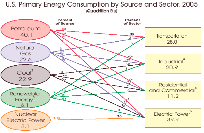
The first visualization, created by Energy Information Administration, emphasizes the physical connections between energy sources and energy use sectors. This construct is known as a "network graph", and widely used by engineers; the ovals/rectangles are called "nodes", the lines "arcs". It functions well as a map visualizing physical relationships but it fails as a vessel for data. Problems are multiple:
- The web of arcs is messy and gets worse with more nodes
- Here, each node has either an input or an output but not both, keeping it simple. If a node is allowed to take both input and output (the so-called transhipment node), then the graph gets messier
- Arcs converging at a node leave little space for data labels

Next, the Skeptical Optimist blog recast the data onto a construct known to "Marimekko" to management consultants. Deconstructed, these are column charts, such that the width of each column represents the relative size of each energy source.
This one does a fairly effective job showing most of our transportation needs are met with oil, our electricity needs are met with coal, our energy sources are roughly split between oil, gas and coal, and so on.
One weakness of Marimekko is "inequity": by its origin as a column chart, it elevates one variable over the other. What's the relative size of energy used by the industrial sector (blue)? That's not a question easily answered by this chart. Even when the column segments are adjoining, as in the case of electricity use (yellow), it is very taxing to size up the yellow area relative to the total area.
So it is that we seek a graph that treats the two variables (source, use sector) equitably. More later.
Update: Jon posted a response here, and points to a tutorial for creating Marimekko type charts.


