Graphs as catalogs
Junk Charts typically concerns itself with statistical graphics a la Tufte and Cleveland, treating charts as a means to summarize, elucidate and highlight aspects of data. We haven't been too kind on so-called infographics, often finding these cluttered and confusing. Recently, I have a small change of heart.
I now see infographics as innovative in one way, and a complement to traditional graphics. This is the idea of graphs as catalogs. What many of these graphs try to do is to present a structured way for users to explore massive amounts of data. They don't serve the traditional purpose of summarization and that's why they are innovations.
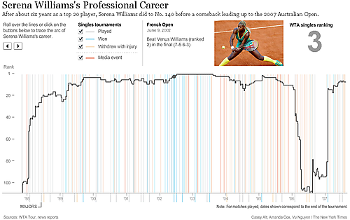
The following chart from NYT tracing Serena Williams' tennis ranking prompted this post.

As a traditional statistical graphic, this chart leaves much to be desired. The general outline of her career could be described in one sentence without the need for any graphic. The colorful vertical lines serve little purpose, nor the short line segments on the other side of the axis.
However, as a catalog of data on Serena's career, this graphic is fascinating. Mousing on the vertical lines changes the information on the top right corner, including the tournament being played and the media event she participated in, as well as photos and her rankings. Similarly, the left and right arrows on the top left allow readers to browse through the list of events chronologically. (You need to click on the link to use the interactive features.) Without this chart, it would have been very difficult to learn about Serena's record at a particular tournament or point in time. It acts like a data table but presents the information in a much more accessible way.
Thus, relying on interactivity, this compact graphic enables any of us to browse to a user-defined depth a reservoir of data. Bravo!
Reference: "Serena William's Professional Career", New York Times, June 2008.