Guess which day I made this chart
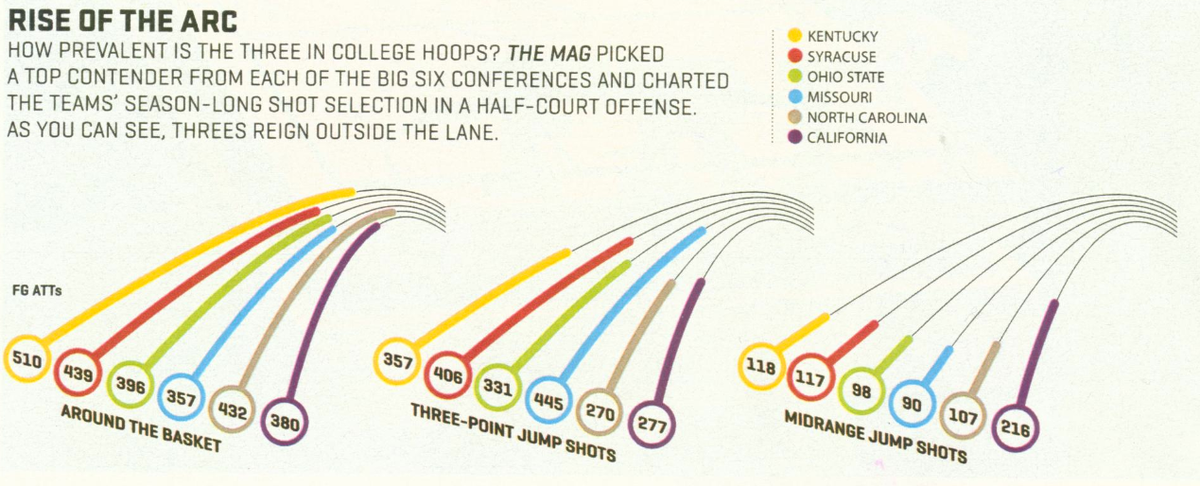
ESPN Magazine issued a special analytics edition to ride the Moneyball bandwagon. In an article talking about the disappearing midrange jump shot from college basketball, they put out this chart:

In the caption of the chart, the key conclusion is: "As you can see, threes reign outside the lane." Well, we must be blind, since that conclusion is very difficult to draw from what we see. A number of reasons contibutes to this failure:
- In a chart like this, the reader is cued to the length of the arcs. But the arcs related to three-pointers are all medium length -- they don't stand out, exactly the opposite of what the caption is saying
- It's impossible to interpret the scale of the chart. Compare the blue line on the left (Missouri around-the-basket attempts) and the yellow line in the middle (Kentucky three-pointers attempts). They both say 357 but the lines are clearly of different lengths.
- The analyst is attempting to make a general statement about "college hoops" while the data being presented are from six specific teams. This means that readers are spending time digesting the variability between schools rather than understanding the commonality across schools.
The problem of this type of "racetrack graph" has been discussed here before (see here or here). By using ellipses rather than circles, this chart makes things worse. Now, we can't even imagine where the center of the circle is to judge the angles.
***
The following line chart has a few revelations:

- The six schools are not all the same in terms of their shot selection. In particular, California is the exception to the rule. Also, Missouri and to some extent Syracuse are extreme examples where their players try about the same numbers of three pointers as around-the-basket shots. In our Trifecta checkup (explanation), this means the data used on the chart is out of sync with the key question being addressed. No amount of graphical wizardry can fix this problem.
- The new chart uses much more sensible units, attempts per game. The original chart shows total attempts for matches up to the day the chart was prepared. To make matters worse, the designer did not disclose anywhere what day that was, or how many games were included. By looking at season-end statistics (34 total games), it appears to me that the data being plotted are the total attempts in the first 22 games (up to the end of January). No reader can interpret total attempts in the first 22 games. I just divided each number by 22, and for anyone who follows basketball, this unit is much more interpretable.
- What determined the order of the six schools being plotted? Your guess is as good as mine. In our version, I sorted the schools by the ratio of three-pointers to midrange jump shots. So Missouri and Syracuse came out top because they focus so heavily on three-pointers at the expense of midrange shots. At the other extreme, California uses both types of shots in about equal proportions.