Guide to using pairs of circles
A discussion of some design decisions
In my last post, I featured the following student project that uses nested circles to compare pairs of data.
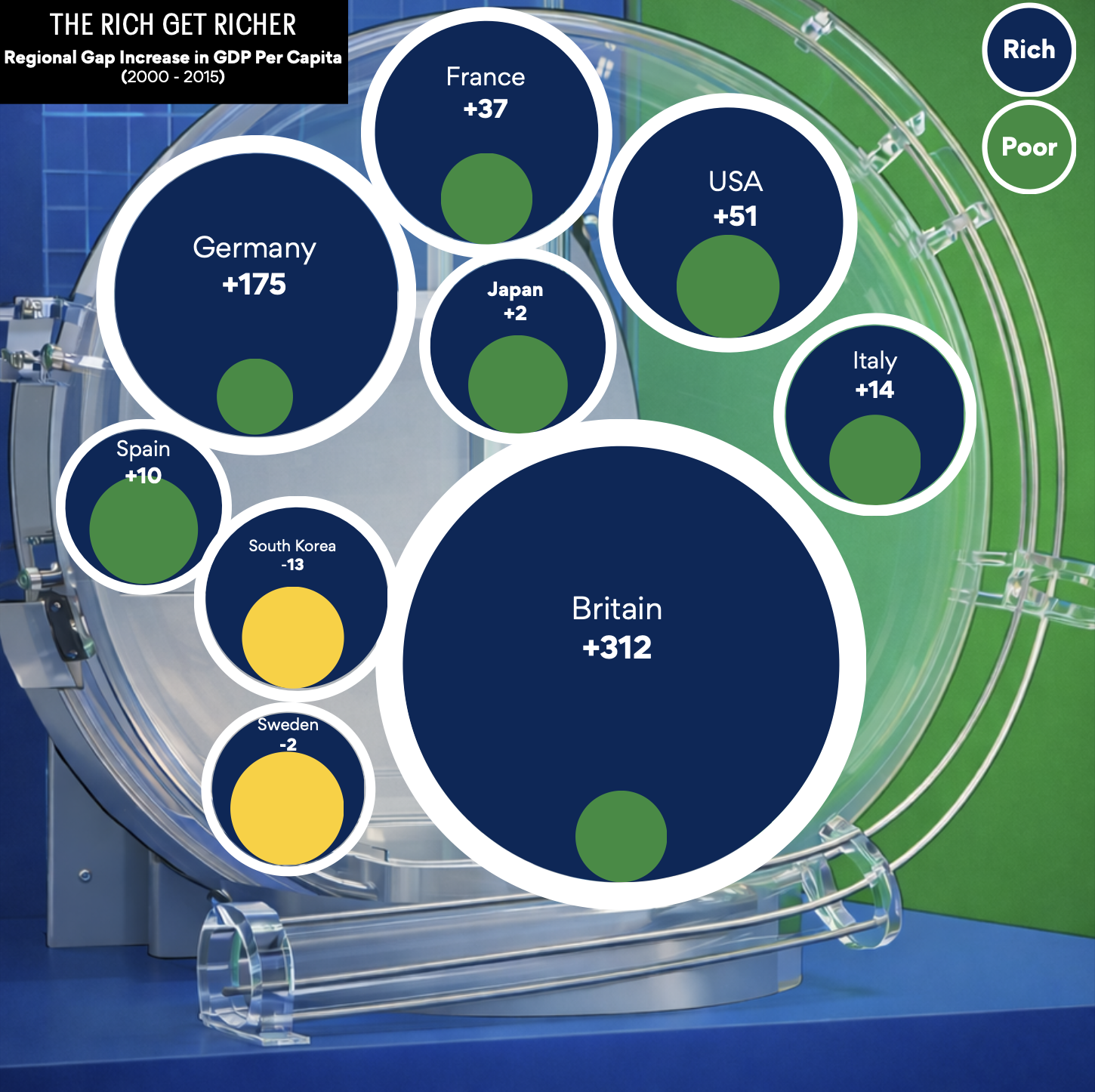
The underlying data are measures of change in wealth over time, specifically, a 15-year period (2000-2015). In each pair, one circle represents the "rich" and the other circle represents the "poor". So, for each country, there are two numbers being compared. For most countries, since the rich is getting richer, the "rich" circle is the larger one.
I find it useful to start by looking at the "boring" way of presenting the same concept, using side-by-side bar charts.
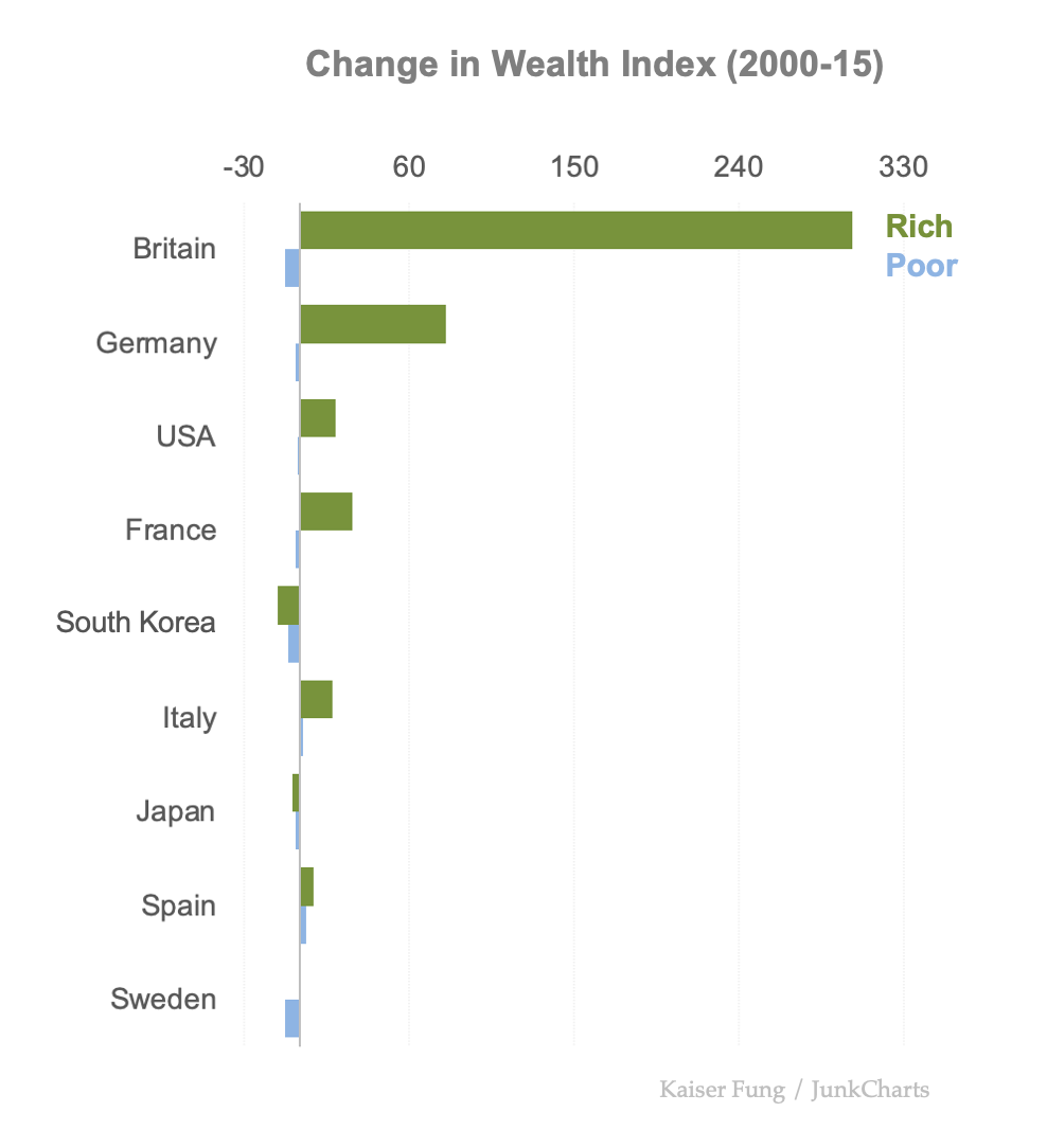
This dataset contains certain identifying features, due to how the Economist chose to define wealth disparity. Each number is the relative wealth of the rich (or poor), relative to the national average (=100), in each year. Because of the skewness of the wealth distribution, the numbers for the rich are usually quite a bit larger than those for the poor; it follows that the numbers for the change in wealth are also larger than those for the poor. In fact, the change in wealth for the poor is typically negative: if the rich are running higher, the poor should be falling lower! In each year, the average is pinned to zero. An exception is if the middle class lags while both ends of the distribution gain.
The circular version separates the direction and magnitude of the data: the circular areas encode the absolute values of wealth changes, while the colors show the direction of change (up or down).
In this post, I explore a few design decisions when making such circular charts:
- sizing individual circles,
- handling direction and magnitude,
- determining relative sizes of circle pairs.
The basics first. Since the data are encoded in the areas of the circles, and the area of a circle is proportional to the square of its radius, we usually have to feed the square-root of the data to the plotting software.
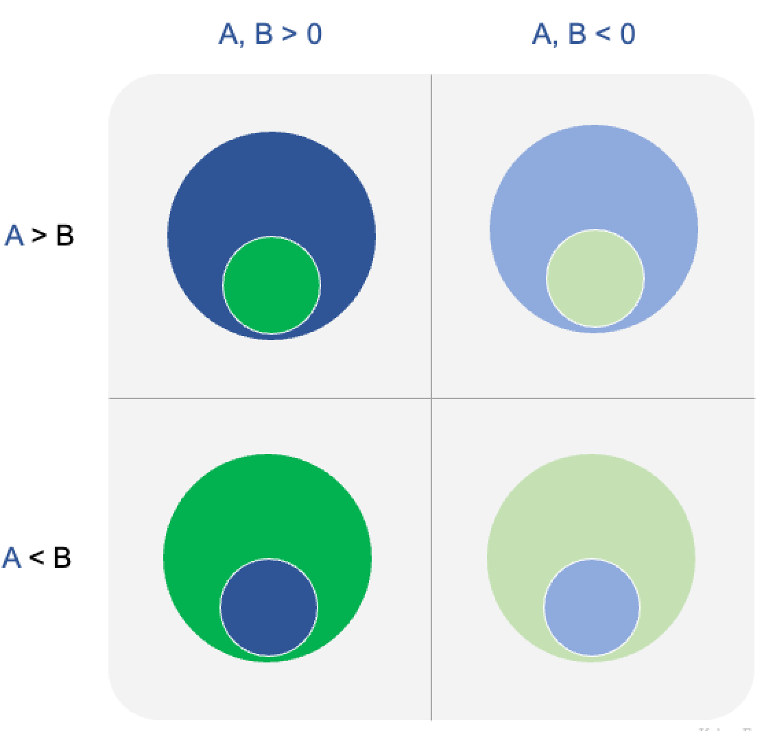
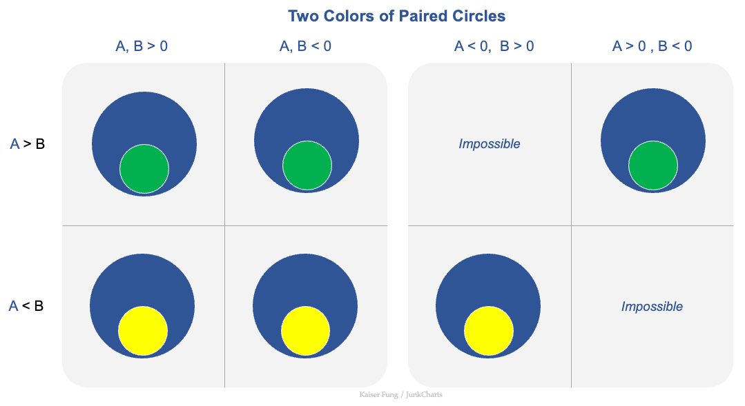
Let's take a generic pair (A, B). There are three possible relationships between A and B: A>B, A<B, and A=B.
The strict inequalities can be simply accommodated:
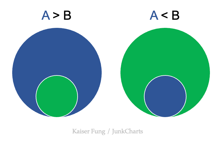
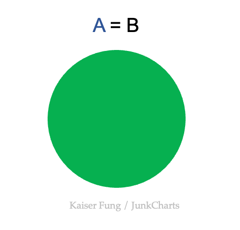
The case of equality disturbs the peace. When A=B, the two circles have the same areas; they completely overlap.
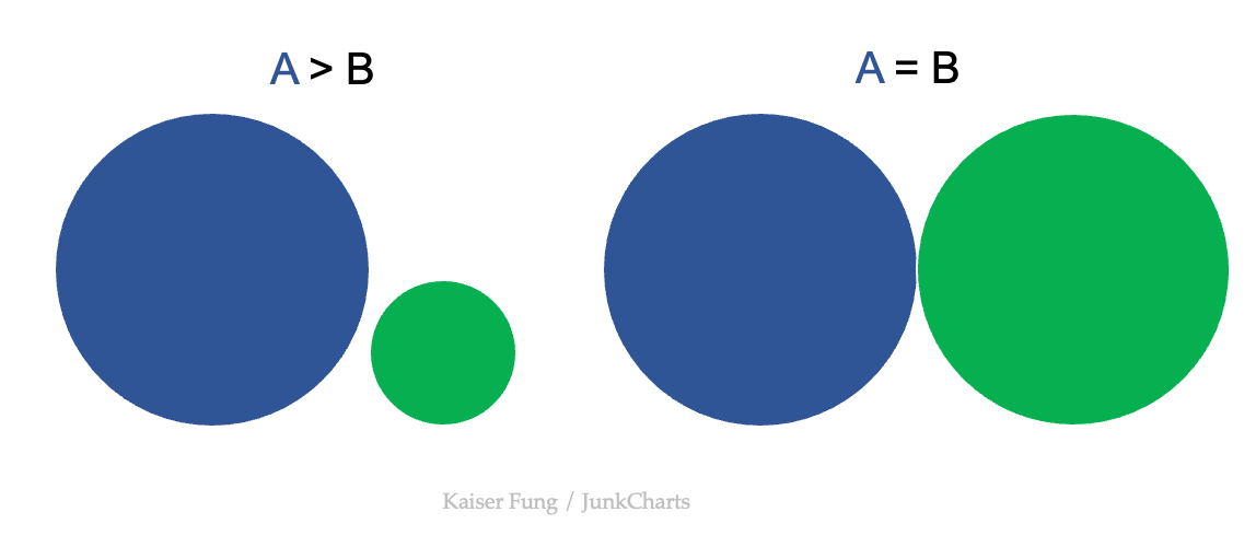
One way out of this problem is to assert that the case of A=B is sufficiently rare as to be ignorable. I'd be willing to accept such an assumption in the case of the wealth inequality dataset.
If such an assertion is not supported, then a more creative solution is needed. For example, put them side by side.
An additional complication arises when the data contain both positive and negative values, which is the situation with the change in wealth data.
As shown below, we have six feasible configurations, requiring two colors plus two tinges, coupled with which circle is larger.
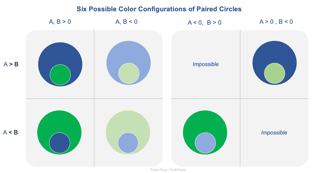
In each configuration, which circle is larger is immediately apparent. Then, the tinge signals whether the individual element (A or B) has positive or negative sign. In our dataset, the tinge signals either gain or loss in relative index over time.
Alexis, the student who made the featured chart, simplifies the situation, as she applies color to the gap in wealth changes (i.e., \(A - B\)), rather than the wealth changes themselves (A, B). Thus, there is only one value, and one corresponding color, per pair of circles.
The larger circle is given a fixed color (blue here). The color of the smaller circle is the direction of the difference in wealth changes between the rich and the poor – in other words, the direction of the wealth gap.
The simplicity is achieved by giving up the ability to distinguish between the various cases shown above. We go from six possibilities to two.
In Alexis's chart, all circles conform to an unspoken single scale, aligned to the 2015 relative wealth index for the rich.
This represents a third dimension. The pair of circles shows the wealth changes of the rich and the poor. The designer has freedom to choose what to use for this third dimension. This is not a decision available for the standard bar chart presentation.
The following illustrates the effect of introducing a third dimension. The top set of circles does not utilize the third dimension while the bottom set of circles does.
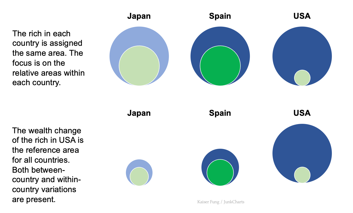
In the top row, the focus is within-country variation. In Japan as well as Spain, both the rich and the poor shifted in the same direction between 2000 and 2015, and the magnitude of the shift of the poor was roughly half that of the rich. In the United States, the rich got richer while the poor got poorer. The wealth change for rich Americans was roughly 20 times that for the poor.
In the bottom row, the sizes of the circles for Japan and Spain are all aligned with those for USA. Both within-country and between-country variations are present.
It's up to the designer to figure out whether, and how, to utilize this third dimension.