Hanging tough
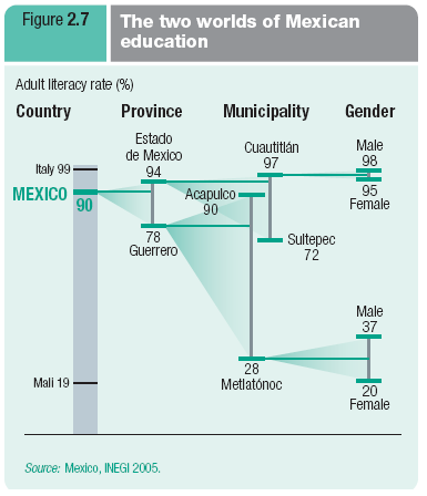

Reader Nick B. sent in this example calling it "interesting". The chart tells a compelling story once we figure out what it is. Grasping the tree structure is key.
It illustrates the important idea that averaging sometimes masks variations in the data. For example, while the province of Guerrero scored 78% on literacy, the municipalities within Guerrero had scores ranging from 28% to 90%.
It also shows that the gender gap was larger in lesser Metlatonoc municipality than in more literate Cuautitian.
In addition, it tells us that while Mexico on average measured very well on literacy, subpopulations within Mexico spanned the world's best and worst (from about Mali's level to Italy's).
While I find this chart adequate, the pieces hanging off each other did not seem ideal, especially the two overlapping municipality pieces which were placed next to each other. However, it is tough to come up with an alternative. Here's one attempt; the changes are mild.

I prefer the horizontal orientation.
The branches are emphasized (as opposed to the "T" junction) because that's a key part of the story.
The national level, especially the span between Mali and Italy, is de-emphasized; I treat it as gridlines.
Instead of placing the overlapping pieces next to each other, I let the ranges literally overlap, which serves to stress this feature.


