Hiding the message with bar charts
Since the purpose of data visualization is to reveal insights, a chart that hides its message is bad; the reader can recognize a bad chart within seconds.
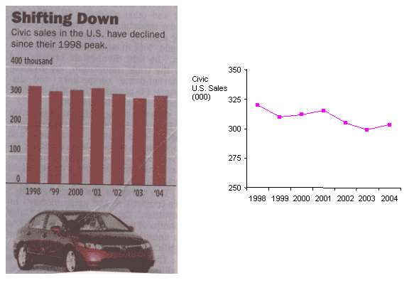
Sometimes, good advice can be taken to extremes. Here is an example from the Wall Street Journal (on the left):

While the caption informs us that sales of Civic cars have declined since 1998, this message is buried in tall and thick bars that are similar in height, the downward trend not at all obvious. Possibly, the designer is taking advice seriously; I'm sure a guru or two has written about it, that honest chartists start the vertical axis at 0 so as not to exaggerate small differences. This tip is somewhere in one of these seminal books, by Tufte

or by Wainer
.
However, for this chart, the difference is the message, and starting the axis at 0 serves to hide this message. The junkchart version fixes the vertical scale and instead uses a line chart. The downward slope is now clear but we also observe that sales have fluctuated over the years. Prof. Gelman, a sometime visitor here, also has also suggested that line charts are often more effective than bar charts.
Reference: "Honda, in a Funk, Tries to Revive the Civic's Virtues", Wall Street Journal, Sept 9, 2005.


