High-effort graphics
What's the return on effort?
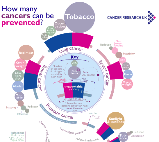
Jon Quinton made a chart for Cancer Research UK, which is quite an eyeful.

The full infographic is here.
Below is a close-up of the key of this chart:


Where would this chart fall in my "return on effort matrix"? It is an extremely high-effort chart; I got tired trying to figure out what all those dimensions mean.
Is it a high-reward or a low-reward chart? It depends on why you're reading the chart. For most readers, I suspect it's low-reward.
***
In my view, the best charts are high-reward, low-effort. I'd emphasize that by effort, I mean effort by the reader. In general, the effort by the chart designer is inversely proportional to that by the reader.
In some special cases, high-effort charts may have high reward justifying the destruction of some brain cells.
Low-effort, low-reward charts are harmless.
More on the return-on-effort matrix here.
***
One simple improvement to a chart like this one is to produce separate charts for men and women. Outside academia, it seems to me almost all use cases for this chart would involve only one gender.


