Higher, higher and higher
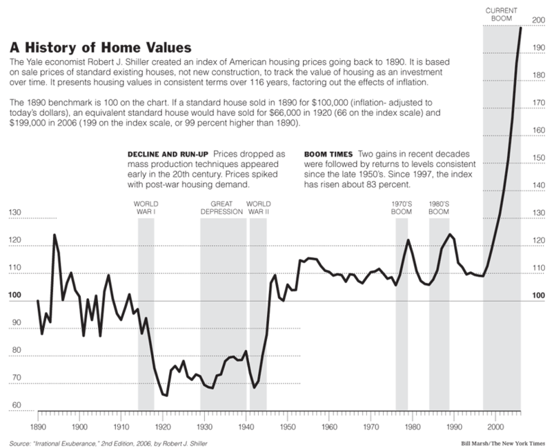

How high can it go? This chart, sent in by Michael McCracken and attributed to Yale economist Shiller of "Irrational Exuberance" fame, very effectively poses this question. The "hockey stick" on the right side of the chart really hits us like a gigantic question mark.
When we have good data, or are looking at the data from the right angle, the charting task is that much easier.
Michael especially likes background shading to highlight specific periods. I'm a bit perplexed by the "World War I" label as that period does not appear remarkable to my eyes; it is also the only shaded reason that is not a boom period.
The text explains the need to remove "new construction" in order to study housing as an "investment over time". As an outsider to the real estate industry, I find this definition arbitrary. The 2001 data presumably would include the sales price of any house that was constructed from 2000 and back. Why exclude only current-year construction? Could a sale of a one-year-old property be considered "investment" and not "speculation"?
Reference: New York Times, Aug 26 2006.


