Imagination gone astray
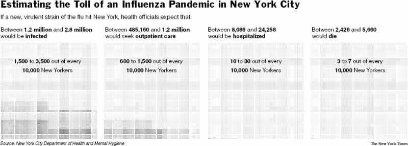
In the field of data graphics, the New York Times has distinguished itself as a leader. The team also takes risks in going beyond the standard and tired repertory of pies, bars and lines. On this occasion, they have surely let their imagination gone astray. Consider this stupefyingly opaque chart:

If you can make sense of it, click on comment below to leave your thoughts:
- how do the graphical elements convey the data?
- how long did it take to figure out what it means?
Reference: "When a Bug Becomes a Monster", New York Times, August 21 2005.


