Jamming
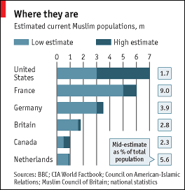

Readers may have noticed that I'm not a fan of the graphics aesthetics of the Economist. (I love their subtle sarcasm, a way of saying something without saying it. For example, the title of this chart is "where they are". They let us read any meaning into the word "they". As for their charts, I have taken issue on several occasions.)
This particular example uses one of their standard formats, stacked bars with an extra data series tagged on the right, its boxed annotation calling attention to itself. It's a case of too much apparatus for a simple task.
The chart's purpose is to show that the US and France have the largest Muslim populations by numbers while France is by far the top country by percentage.

Our junkart version is very much cleaner. Line segments indicating the low, mid and high estimates replaced the stacked bars (which falsely imply significance in adding the low and high estimates). As usual, the minimum of gridlines and axes is used. Instead of jamming two ideas onto one chart, if percentages are more important, then a separate chart should be produced, now ordered by decreasing percentages (see below).
The most crucial improvement is the fine print. Perhaps extending their subtle sarcasm too far, the chart maker omitted context for interpreting the data: namely, that the low-mid-high range represents estimates by up to 5 different sources, each using potentially different methodologies for estimation. This partially explains the huge variance in estimates for the US (or does it?).

Also missing is a comment on why these particular 6 countries were selected. It may give a misleading picture of "where they are" in the context of world population.
Reference: "Where They Are", Economist, June 2006.


