Knowledge transfer
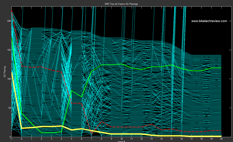
Graphs are indispensable if one is to make sense of large data sets. Kraig W. pointed us to some of the "bump charts" he made of the 2007 Tour de France, and indeed they are quite powerful. (Because of the amount of data, you'd need to see the pop-up image to make sense of it.)

As someone who only has cursory knowledge of the Tour, I learnt a lot from this graph alone. The chart traced the ranking of each rider through 20 stages in the competition.
- Roughly, I am aware that the winner wears the yellow jersey so the yellow line traces the progress of the eventual champion. I also know that the green jersey has something to do with sprinting and so I surmise from this chart that the sprint stages are close to the beginning of the tour and the best sprinter either lost interest or faded away over the course of the race.
- At least the green jersey winner didn't bail out of the race. Another thing we see is that about 180 riders started on day "0" and about 140 finished the tour. (The hash marks on the right play a crucial role here.)
- The bailout lines (that shoot to the skies) should be removed because the same information is provided in the gradual step-down of the lines. Not least because these "explosions" are very ugly.
- Especially intriguing to me is that variance in effect on ranking of different stages. Some stages like 1, 2, 5 and 6 pretty much preserved the ranks. However, stages like 5, 7 and 8 resulted into wholesale redistribution of ranks: not small changes either. Is this tactical movement dictated by the teams or stage-specific influence?
- Then, for stages 9 and 14, only the front half of the ranks were shaken. Stage 13 also stood out: here, almost everyone shifted ranks but only by a little.
- I'm not sure what the pre-Tour ranking comes from (stage -1). The Tour organizers certainly did not reference those.
- I'd imagine that if different teams were plotted with different colors, we may see team tactics in motion.
Would it have been better to plot the "lag times from the leader" rather than ranks? Hard to say. Plotting time differentials will tell us more as ranks remove the magnitude information. However, it can cause the chart to look even more messy.
Graphs are efficient in transferring knowledge. Imagine having to stare at a large table of rankings instead!
Source: BikeTechReview.com, KDUBlog, July 30 2007.


