Leave good alone
In Cousin misfit, we looked at a problematic area chart in which the areas on the chart contain no useful information. The lines in a line chart should carry some meaning, and so too should areas in an area chart.

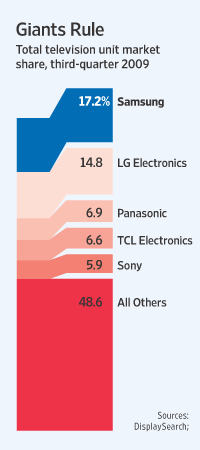
The Wall Street Journal recently printed something that looked like a cross between a column chart, an area chart, and a flow chart. Whatever it is, the areas of the pieces do not match the data.
The data describes how the TV market is split between the top 5 brands (comprising over 50% of the total unit sales) and all other brands -- basically the six numbers printed on the chart.
The graphical construct can be broken up into three parts: a stacked column (on the left), a stacked column with gaps (on the right), and some connecting areas (which are parallelograms).
The last two parts are unnecessary, and in particular, the parallelograms distort the total areas.
It can be baffling to the reader why the left column is shorter than the right column when both show the identical data.
At first, I thought this is some kind of flow chart illustrating the change in market share over time but that's not the case.
What's wrong with the standard stacked column?
Reference: "Samsung Edges out TV Rivals", Wall Street Journal, Feb 17 2010.


