Lining things up
Guess where I went for vacation (clue in the chart).
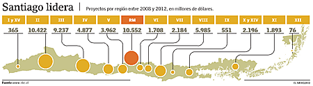
This long, narrow country is divided into 15 regions. In the chart below, an uneven parade of 13 bubbles was used to present some sort of economic projections. The capital of the country was singled out as the top of the table.

The unevenness has a side effect, that the guiding lines are forced to have differing lengths and bewildering turns. Further, because bubbles have no intrinsic scale, the designer must put all the data onto the map as well, thus failing our self-sufficiency test..
The following bar chart version respects the wide, thin space and yet delivers the data more clearly. The top version displays all the data while the bottom one uses a simple axis. The bottom chart is my preference since most readers are probably interested in approximate and relative comparisons, rather than exact projections. (The map would be better off without colors.)

Reference: "Inversiones entre 2008 y 2012 llegaran a US$ 57 mil millones impulsadas por mineria y energia", El Mercurio, Aug 25 2008.


